Creating Collection Views
What is a Collection View
A Collection view is a scrollable view controller similar to a Table View but with one major difference. Instead of having each piece of information represented as a fixed row (or cell) in a vertical-scrolling column within the table, a Collection View has a customizable shape for it's cells.
A Collection View can also stack it's cells in a customizable grid instead of a fixed set of vertically stacked rows, although you can choose to lay the cells out in such a layout if you would like to. The grid of cells can be set to scroll vertically, or horizontally with one or more number of cells per row/column.
Due to the level of flexibility the Collection View offers, you will always use a custom CollectionViewCell class to define the cells of your Collection View.
Set-Up for This Example Project
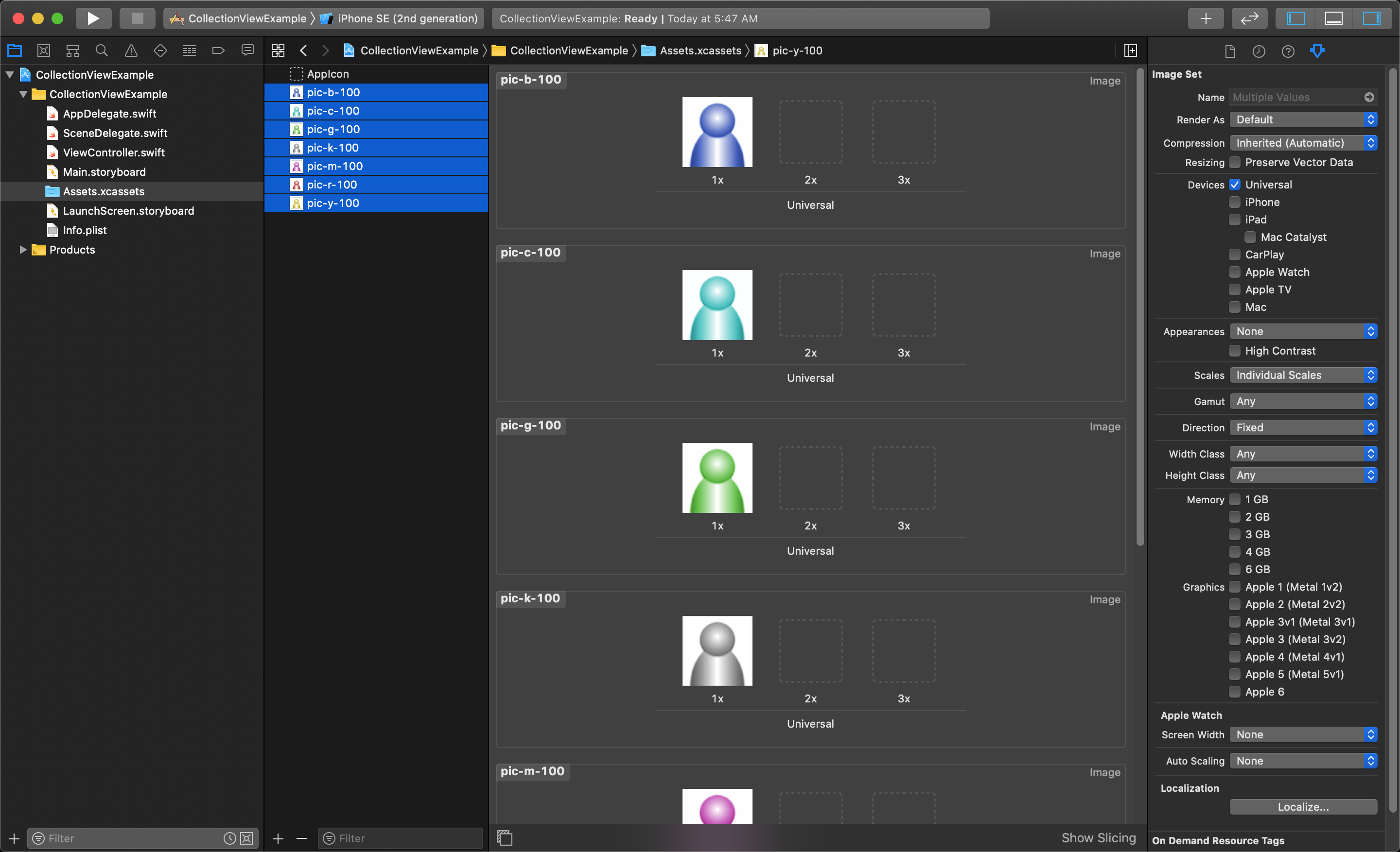
For this example we will reuse the the images from the Table View lessons. You can downloading this zip file containing test images to work with. After unzipping the images to a folder on your computer, you will need to add them to your Assets.xcassets folder in your project.
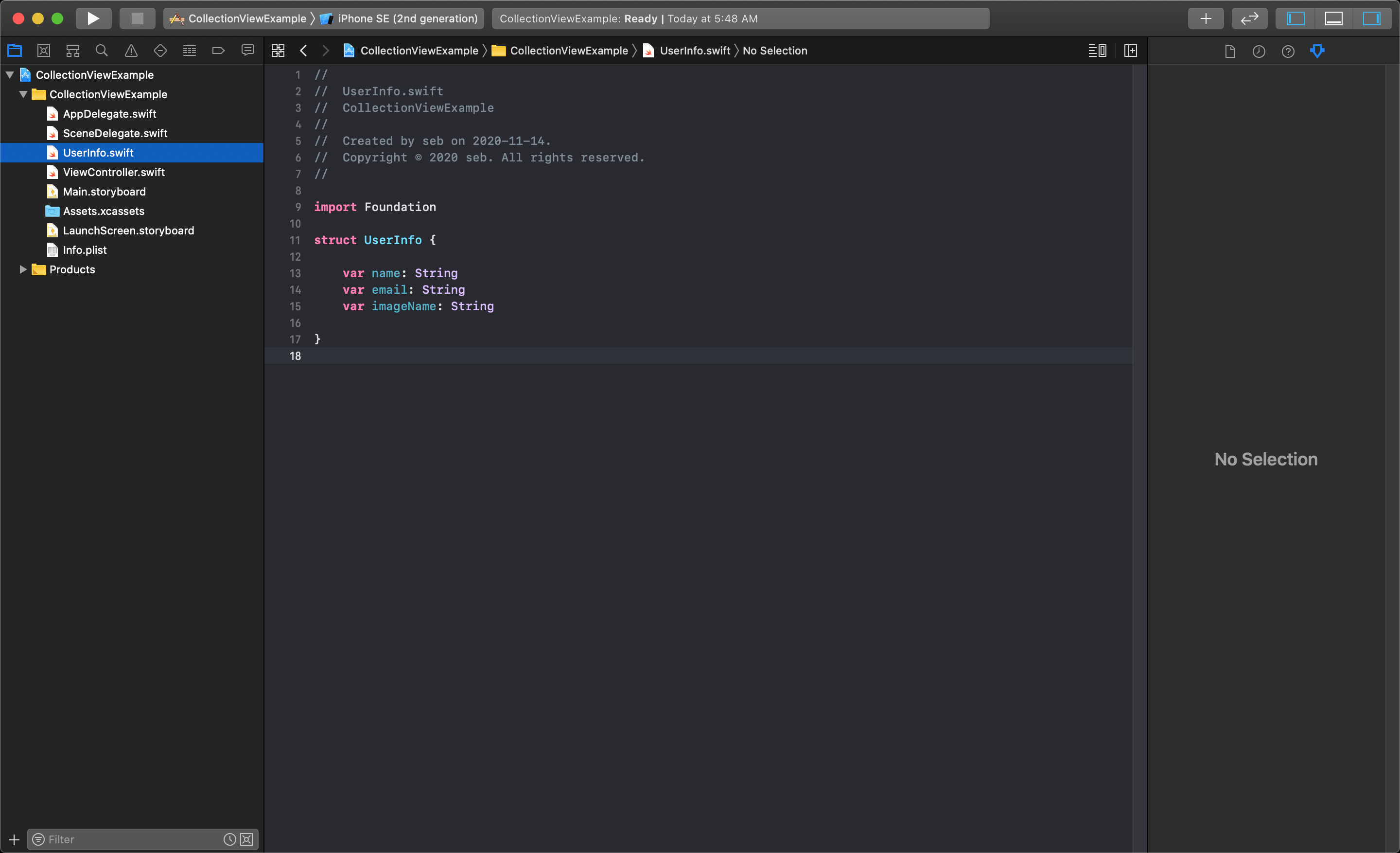
We will also be using the UserInfo class from before in this lesson, so import (or recreate) it in this project.
Setting Up the Collection View
This section will detail how to set up a collection View Controller, along with the required Collection View Cell. First we will need to add a custom CollectionViewController class to our project.
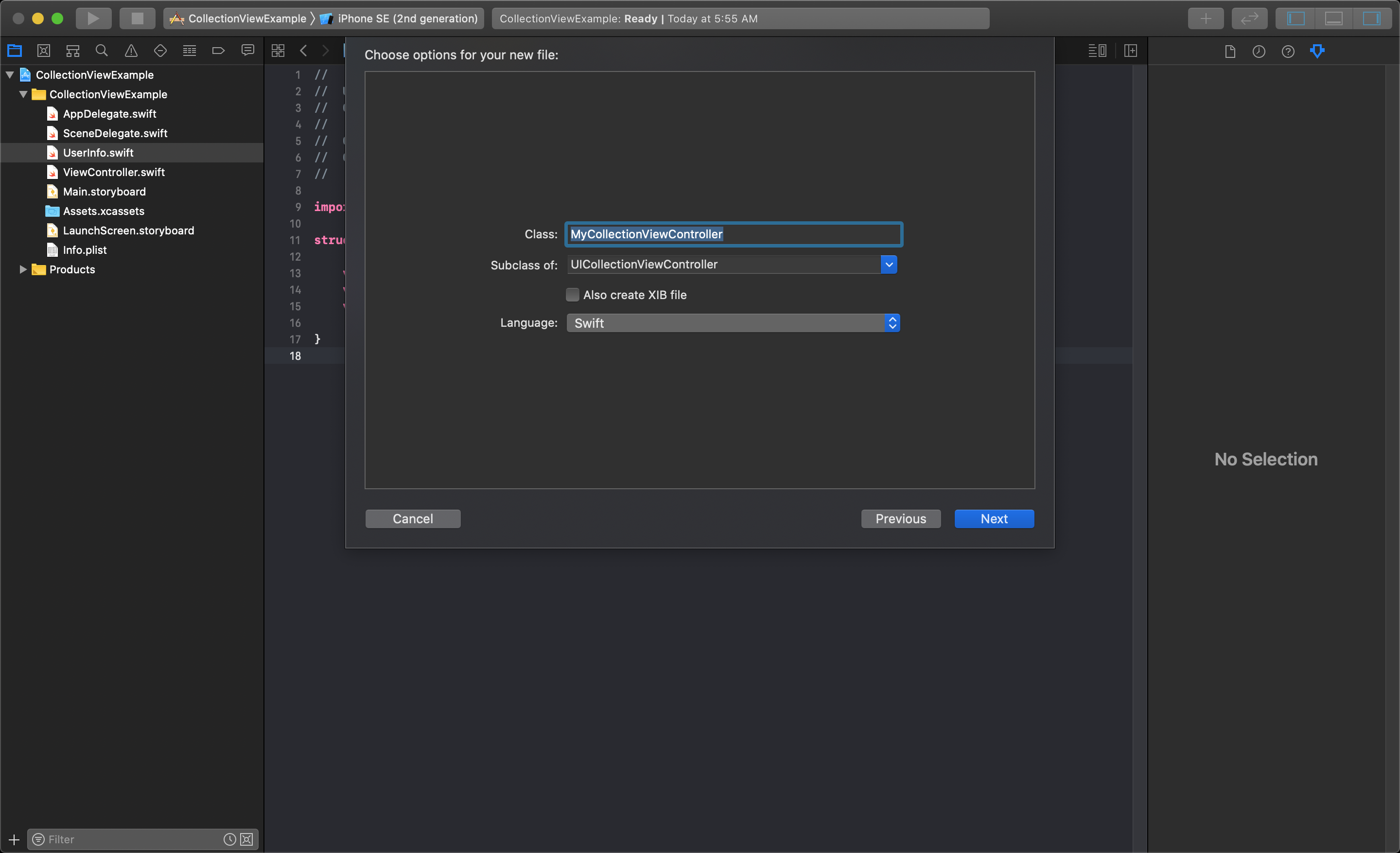
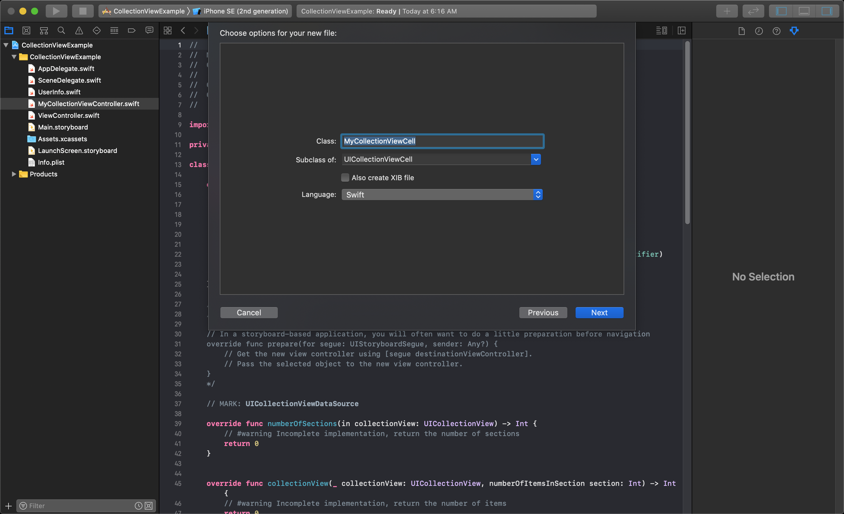
Because you are required to create a custom Collection View Cell you will need to also create a new CollectionViewCell class file as well.
NOTE
You must make sure you are selecting the correct 'Subclass of' options when you create your classes to assure you are not introducing errors into your project.
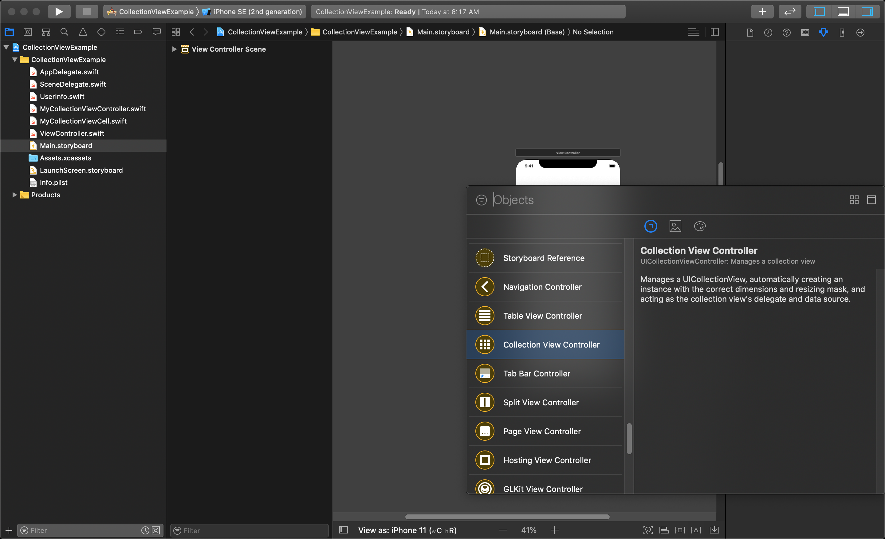
Now that you have the needed classes, you need to add a Collection View to your storyboard. The following shows what the Collection View looks like in the storyboard library.
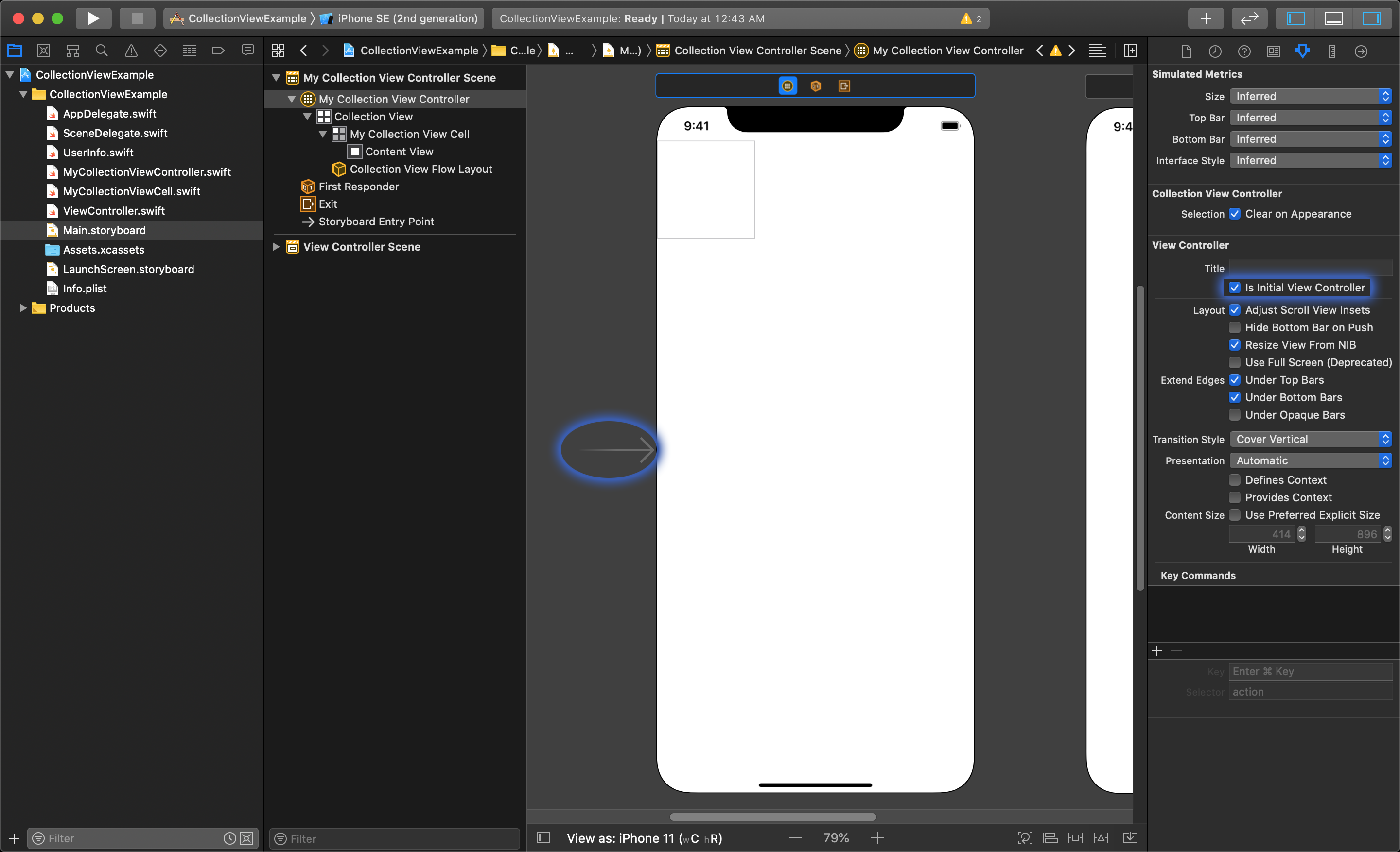
After adding it to the storyboard in this example, you need to set it as the initial view controller. You can do this by dragging the entry point arrow from one view to the next, or checking the "Is Initial View Controller" option in the Attributes Inspector when you have the Collection View Controller selected.
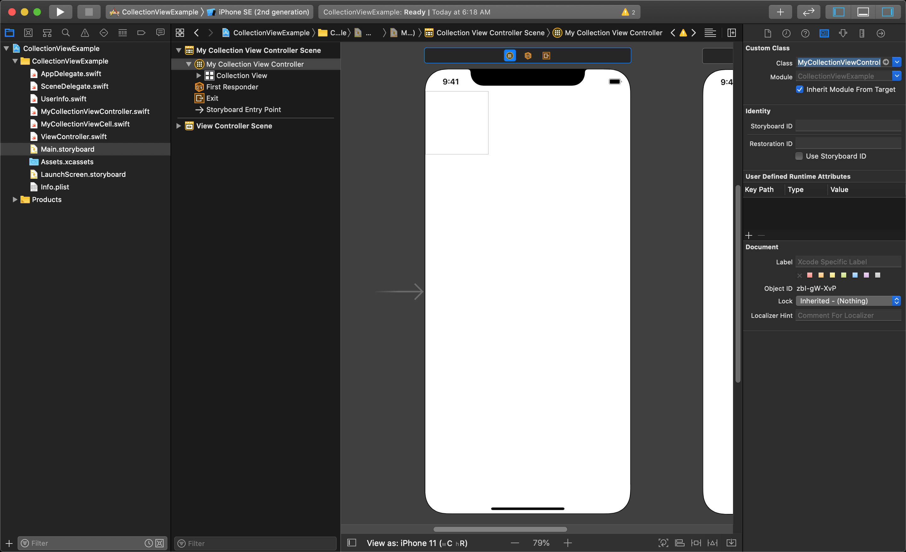
Then you must set the class of the Collection View Controller to use the custom class you have created. Select the Collection View Controller and open the Identity Inspector and set the class to use your custom CollectionViewController class name.
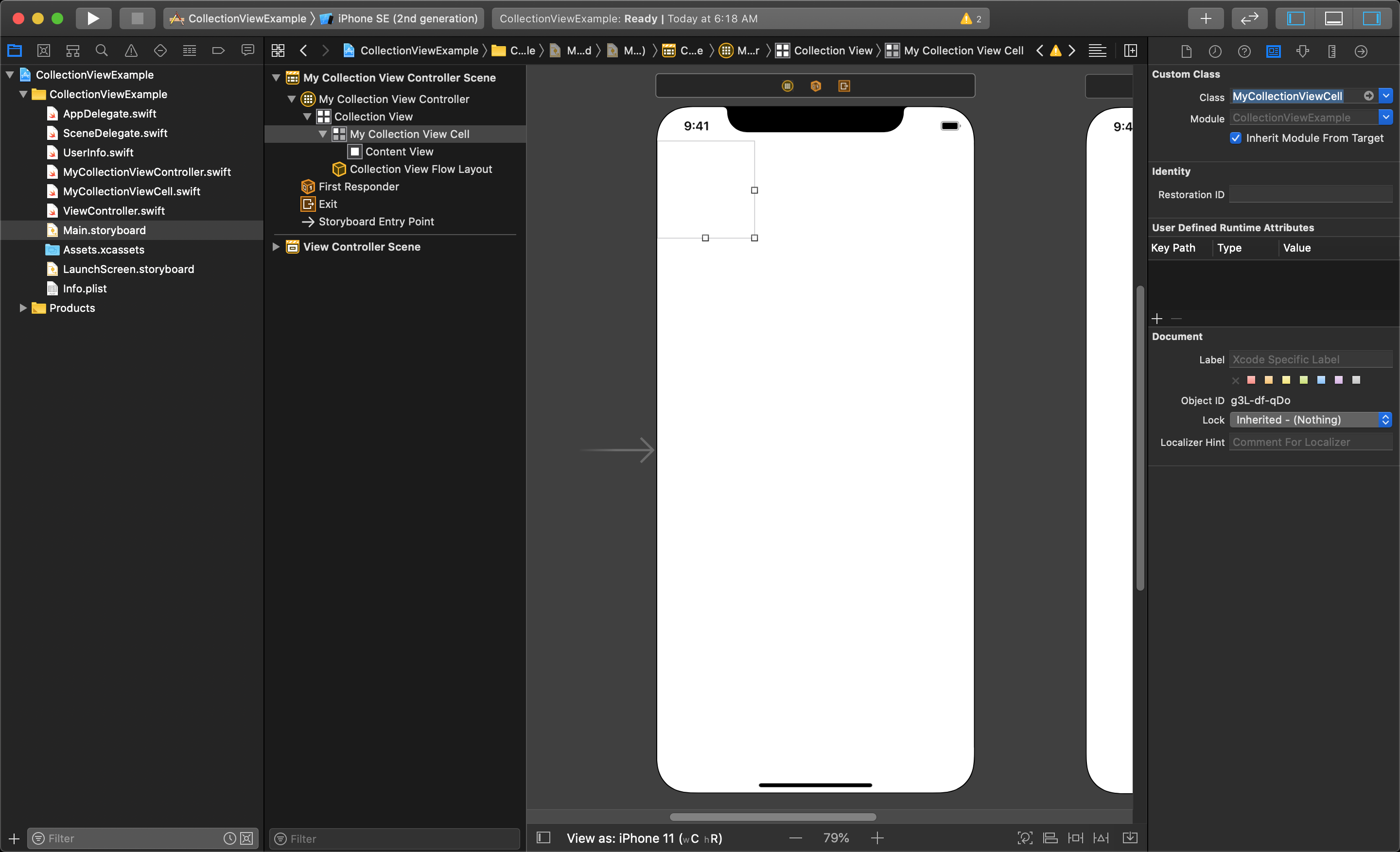
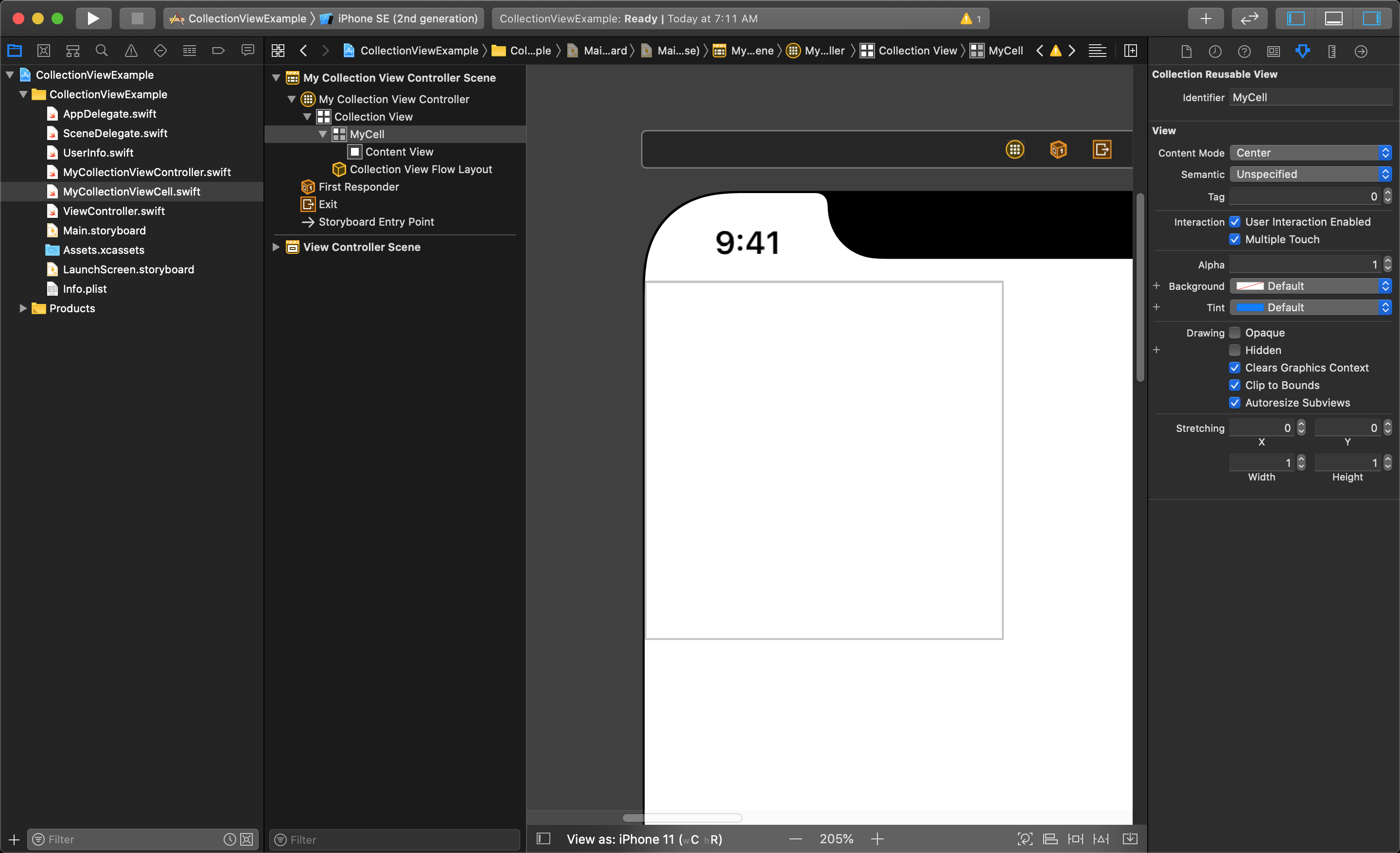
Next you must select the Collection View Cell by clicking on the small box in the upper-left corner of the Collection View Controller. Then, in the Identity Inspector and set the class to use your custom CollectionViewCell class name.
Customize the Collection View Cell
The next steps will be to setup the Collection View Cell with a custom layout and connect it to the custom class file that was created for it.
The first thing to remember to do is give your cell a Reuse Identifier name. Select the cell and enter the identifier in the filed atop the Attributes Inspector.
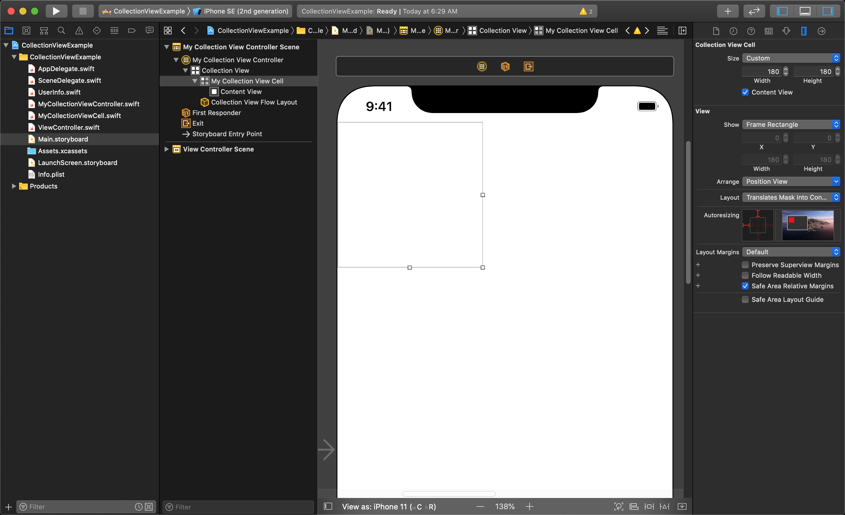
Depending on the design, you will probably want to increase the size of the cell in the storyboard just to give more space to work with. With the cell selected, open the Size Inspector and change the Size parameter from Automatic to Custom. Then choose a width and height that works for you, in this case both have been set to 180.
NOTE
You can also change the shape of the cell by simply selecting the cell, and dragging the anchors on the bottom, right and corner. This will change the size to Custom automatically.
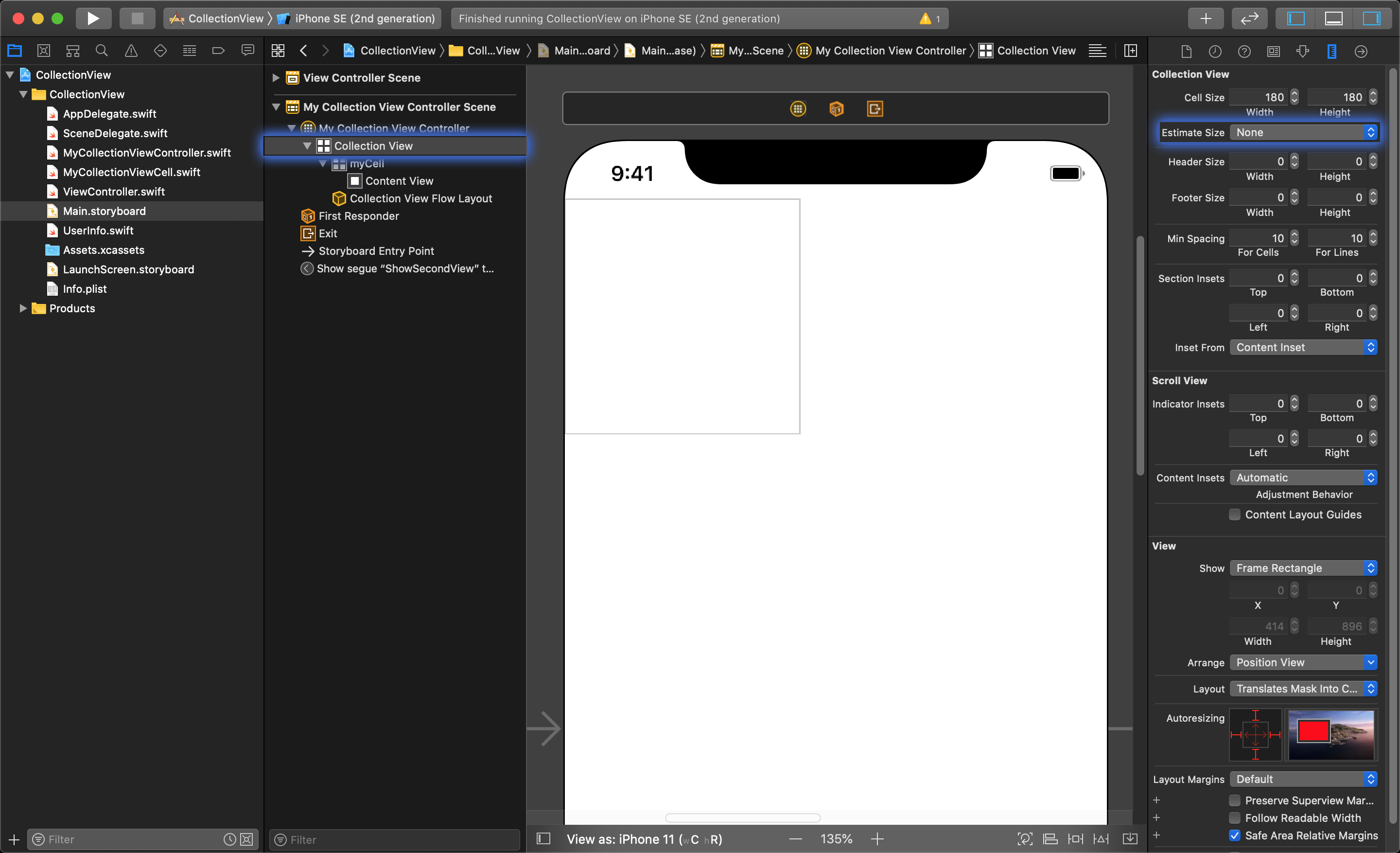
The size you have set here (180 x 180) is not going to be the final size of the cells, but will be big enough to help you layout the UI objects in the collectionViewCell. You will be changing the size of the cells in code programmatically so we need to tell the collectionView to not automatically estimate the size the cells for us.
To do this we need to click on, and select the CollectionView itself (and not the CollectionViewController). Then open the size inspector and set the Estimate Size value to "None" (by default it is set to "Automatic").
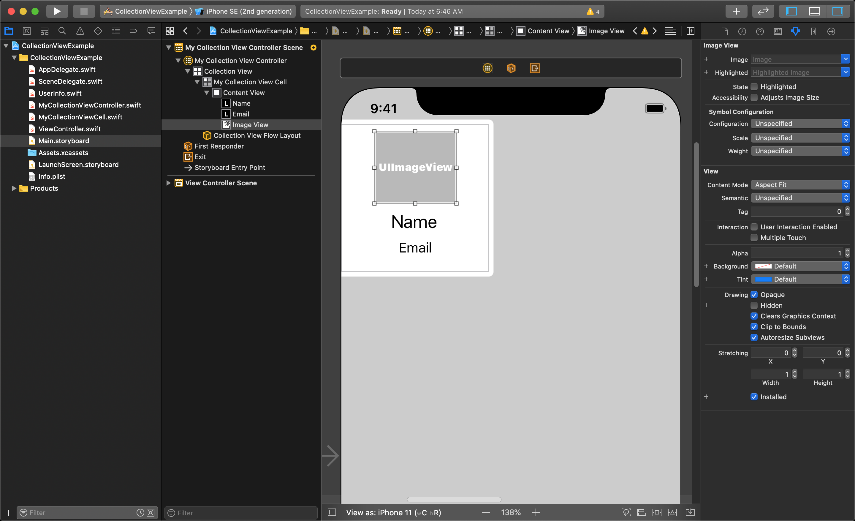
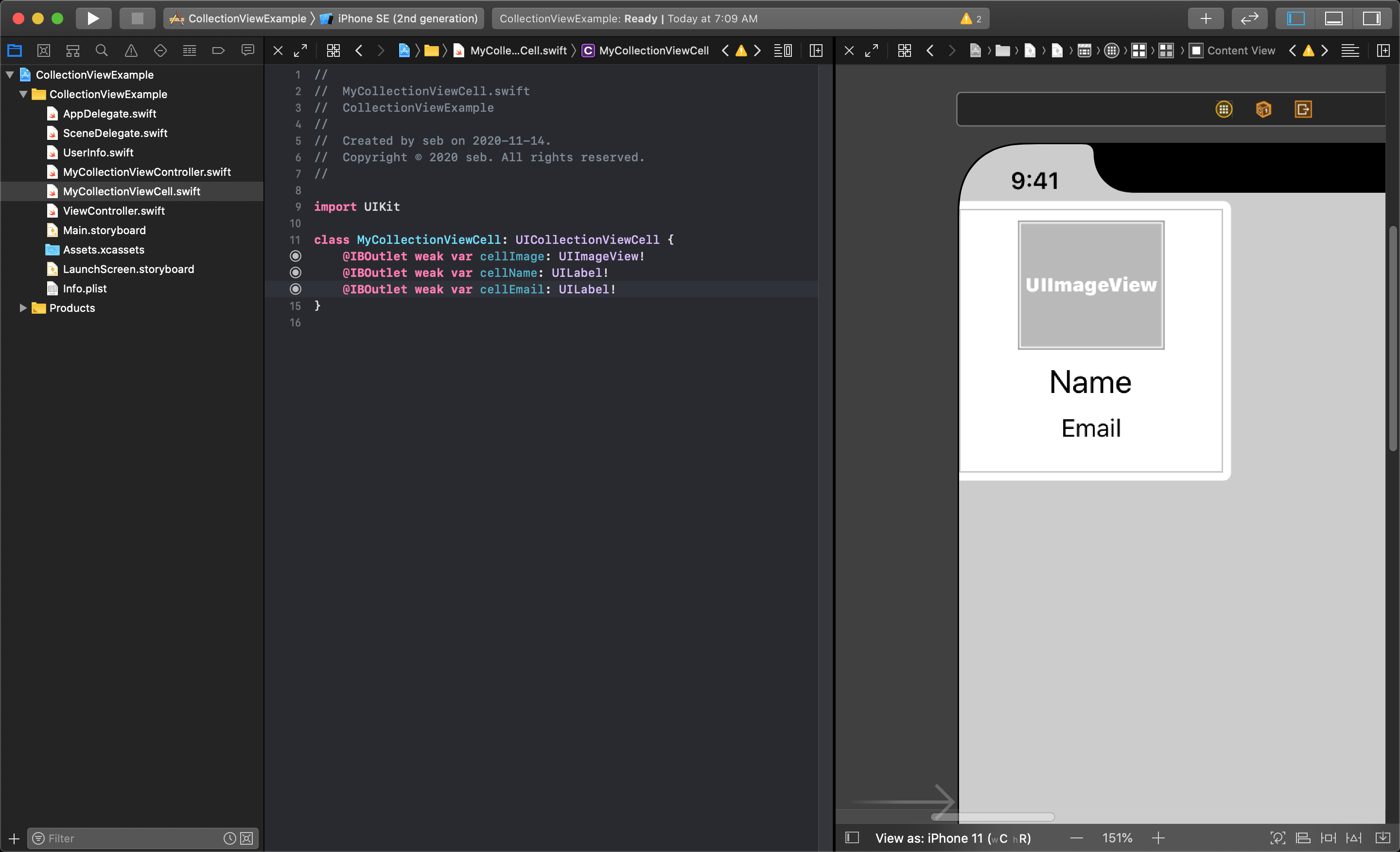
After this, you can now start to populate the cell with the needed UI objects as needed by dragging them from the library into the cell. In this example we have added an ImageView and two labels.
Now you are ready to connect these UI objects to your custom class file. Split the editor to view the code beside the storyboard and make the IBOutlet connects by holding the control key while you click and drag the connection to your code.
NOTE
You will need to add constraints to the cell's UI objects in order to make them fit correctly in the cell as it changes size for different devices depending on your layout. You will also want to set the Autoshrink option to "Minimum Font Scale" for the two cell labels in the Attributes inspector.
Coding the Collection View Controller Class
Prepare the Class
Looking at the code within the CollectionViewController, you will see there are many functions that come built in to this class. Many of the important ones are written for you and left commented out.
By default, there are two line of code that are in this class on line 11 and 22 (as of the writing of this lesson). We will not need these lines of code, and can comment them out.
You should comment out this:
// private let reuseIdentifier = "Cell"
and this:
// self.collectionView!.register(UICollectionViewCell.self, forCellWithReuseIdentifier: reuseIdentifier)
line of code as we are using our own Reuse Identifier we gave to the customized cell in the storyboard.
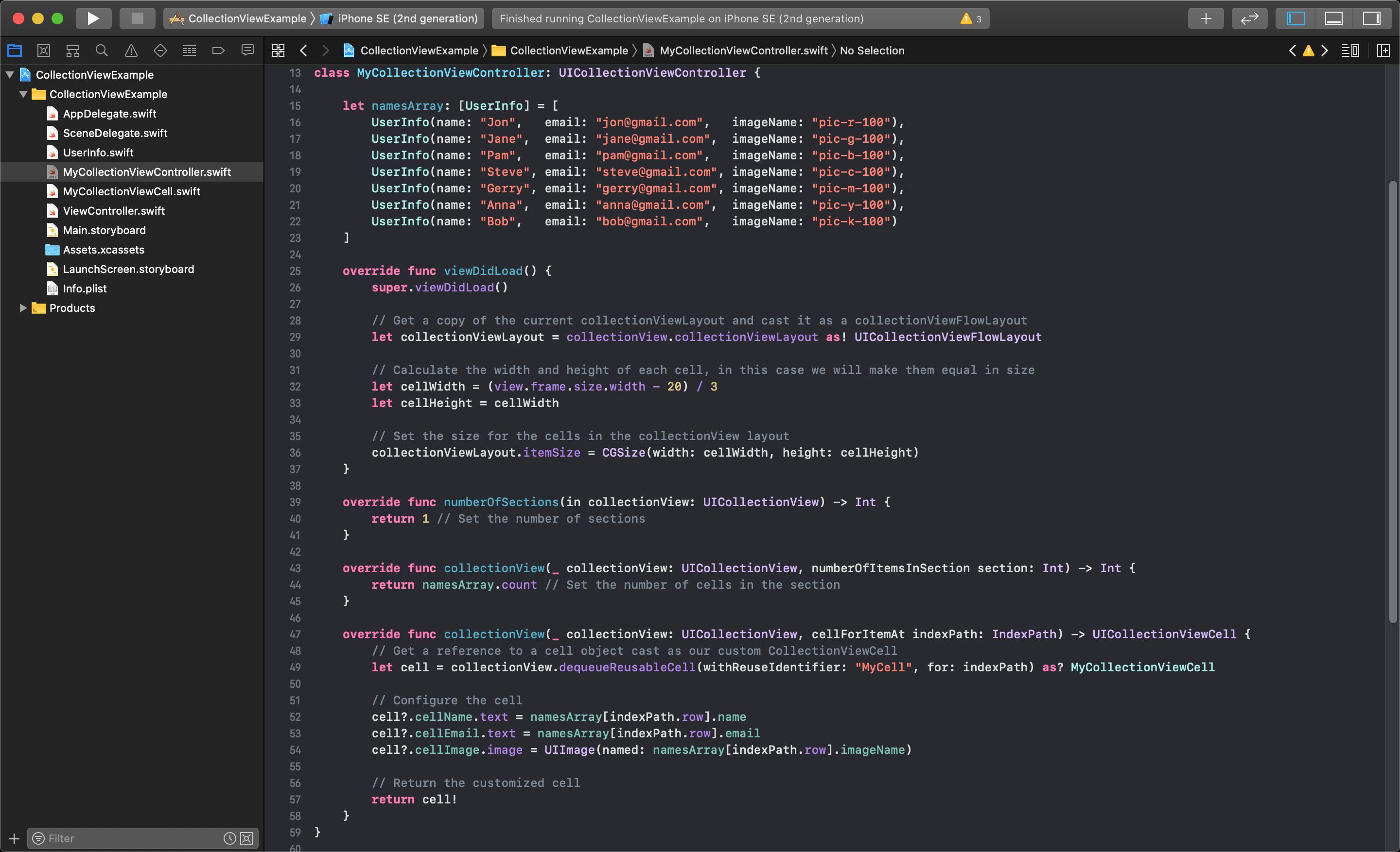
We will also add the array of UserInfo objects inside the custom CollectionViewController class that will be used to test with:
let namesArray: [UserInfo] = [
UserInfo(name: "Jon",   email: "jon@gmail.com",   imageName: "pic-r-100"),
UserInfo(name: "Jane",  email: "jane@gmail.com",  imageName: "pic-g-100"),
UserInfo(name: "Pam",   email: "pam@gmail.com",   imageName: "pic-b-100"),
UserInfo(name: "Steve", email: "steve@gmail.com", imageName: "pic-c-100"),
UserInfo(name: "Gerry", email: "gerry@gmail.com", imageName: "pic-m-100"),
UserInfo(name: "Anna",  email: "anna@gmail.com",  imageName: "pic-y-100"),
UserInfo(name: "Bob",   email: "bob@gmail.com",   imageName: "pic-k-100")
]
2
3
4
5
6
7
8
9
Set the Cell's Shape to Fit Evenly on the Screen
It is required to set the width and height of the cells to properly have them fit evenly within bounds of the CollectionView. To do this you must decide how many cells you want to display in each row, and how much space you want between each cell.
Doing this programmatically will let the cells always be the right shape, with the correct padding between each one regardless of what screen it is viewed on. Let us assume we want to have 3 cells per row with 10 units of space between each cell. This is done within the viewDidLoad() function of the class.
Define the Number of Cells in Each Section
Like with TableViews, you need to define the number of sections in the CollectionView, and the number of cells in each section. This is done with a set of functions that look veery similar to those found in the TableView class.
For this example you will use a single section, and you will use the count of the array of UserInfo objects to define the number of cells.
Define the Content of Each Cell
In a CollectionView you define the content in each cell similarly to the way it is done in a TableView. There is a function called override func collectionView(_ collectionView: UICollectionView, cellForItemAt indexPath: IndexPath) -> UICollectionViewCell {} where you gain access to each cell as it is being created.
By default this function is written with the line of code to get access to the current cell being create that looks like this let cell = collectionView.dequeueReusableCell(withReuseIdentifier: reuseIdentifier, for: indexPath). This function is using the variable that you commented out at the beginning of this class called reuseIdentifier which needs to be changed to the Reuse Identifier used in the storyboard, in this case it was "MyCell".
NOTE
You must also cast the cell as your custom class in order to have access to the UI objects you have laid out.
After this you can use the array information to set the UI objects you added to your custom cell. After you configure the cell there is a line of code that returns the cell from this function to be added to the CollectionView.
NOTE
When you cast the cell to your custom CollectionViewCell class it produces an optional variable, so it must be unwrapped to safely return it from this function.
The following image shows all of these modifications made to the custom CollectionViewController file:
NOTE
All of the superfluous lines of code have been removed in order to make this fit in a single screenshot.
Clicking on a Cell, and Passing Data to Another ViewController
Lets assume you have create a second ViewController to pass some UserInfo object to. Assuming this view has an image and two labels to display the contents of the UserInfo, and a button to unwind the segue, the associated ViewController class might look like this:
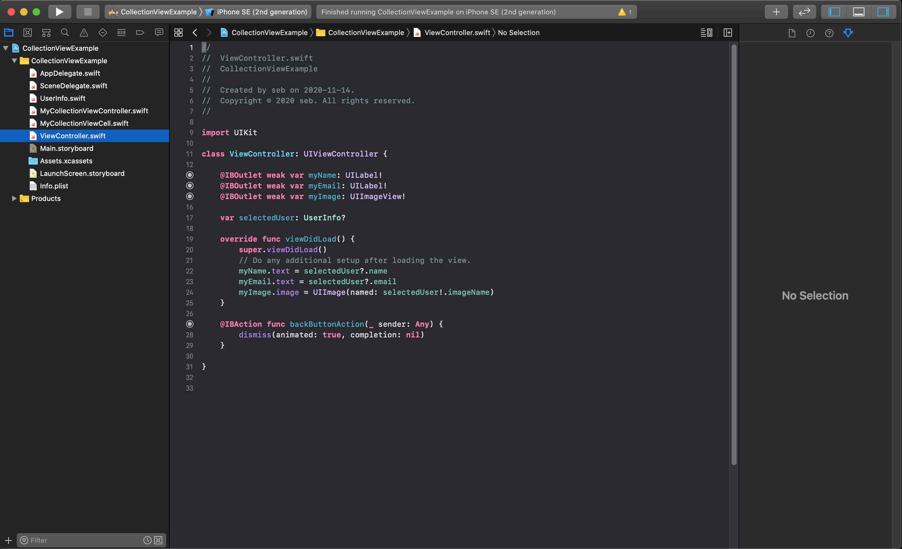
NOTE
In this example the segue will be connected directly from the CollectionViewCell to the next ViewController, and the segue Identifier will be called "ShowSecondView" in the storyboard.
Back in the CollectionViewController class you will need to write some code in the override func prepare(for segue: UIStoryboardSegue, sender: Any?) {} function to get the index path for the selected cell, get a reference to the next ViewController and pass the object from the array to the selectedUser variable. This code would look like this:
override func prepare(for segue: UIStoryboardSegue, sender: Any?) {
    // Detect if the correct segue is triggered by checking the identifyer
    if segue.identifier == "ShowSecondView" {
        // Get the index for the current selected cell
        let myIndexPath = collectionView.indexPathsForSelectedItems![0]
        // Get a reference to the next ViewController
        let nextViewController = segue.destination as? ViewController
        // Pass the correct UserInfo object from the array to the variable in the next view
        nextViewController?.selectedUser = namesArray[myIndexPath.row]
    }
}
2
3
4
5
6
7
8
9
10
11
The value retrieved from the collectionView.indexPathsForSelectedItems value is an array so you must access the first element in order to get the current selected cell. This will allow you to correctly identify what array element to pass to the next ViewController so it's info can be properly displayed.