Responsive Layouts
When developing iOS applications, it is important to keep in mind that different Apple devices have different-sized screens and different pixel densities. You may be developing an application that will only ever be run on a single device (iPhone 8, for example) and only in portrait mode.
When your application is expected to run on multiple devices (or either orientation), Xcode offers you the ability to set up auto layouts that will adapt the UI elements for different screen sizes. This is done by adding constraints to your UI elements, which tells your application how to display those elements for each layout variant.
Building for a Single Device/Orientation
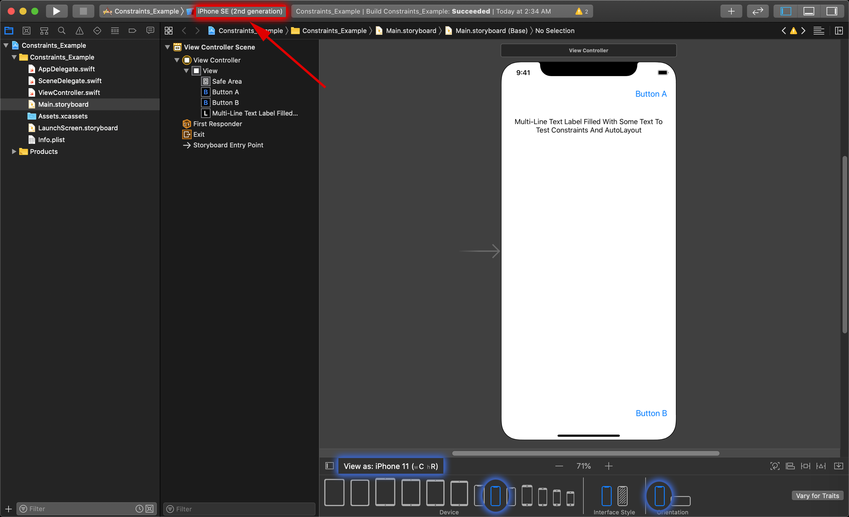
Look at the following example project.
The storyboard layout has a view with a Label displaying multiple lines of text, with a button at the top-right and bottom-right of the view.
If you plan to make your application run on only one device, and in one orientation (landscape vs portrait), then you can simply create your layout in for that specific platform.
To design a layout in this situation, you need to select the desired Device and Orientation at the bottom of the editor by clicking on the View as: iPhone X (xC hR), which opens up a menu showing the Device, and Orientation options. The other thing that still needs to be done here is choose the correct simulator to run the application in at the top of Xcode (here it is still set to iPhone 8 Plus ).
In addition to this, you would need to also restrict what orientation you would let iOS switch your application to while it is being used by the user. This is done in the project settings.
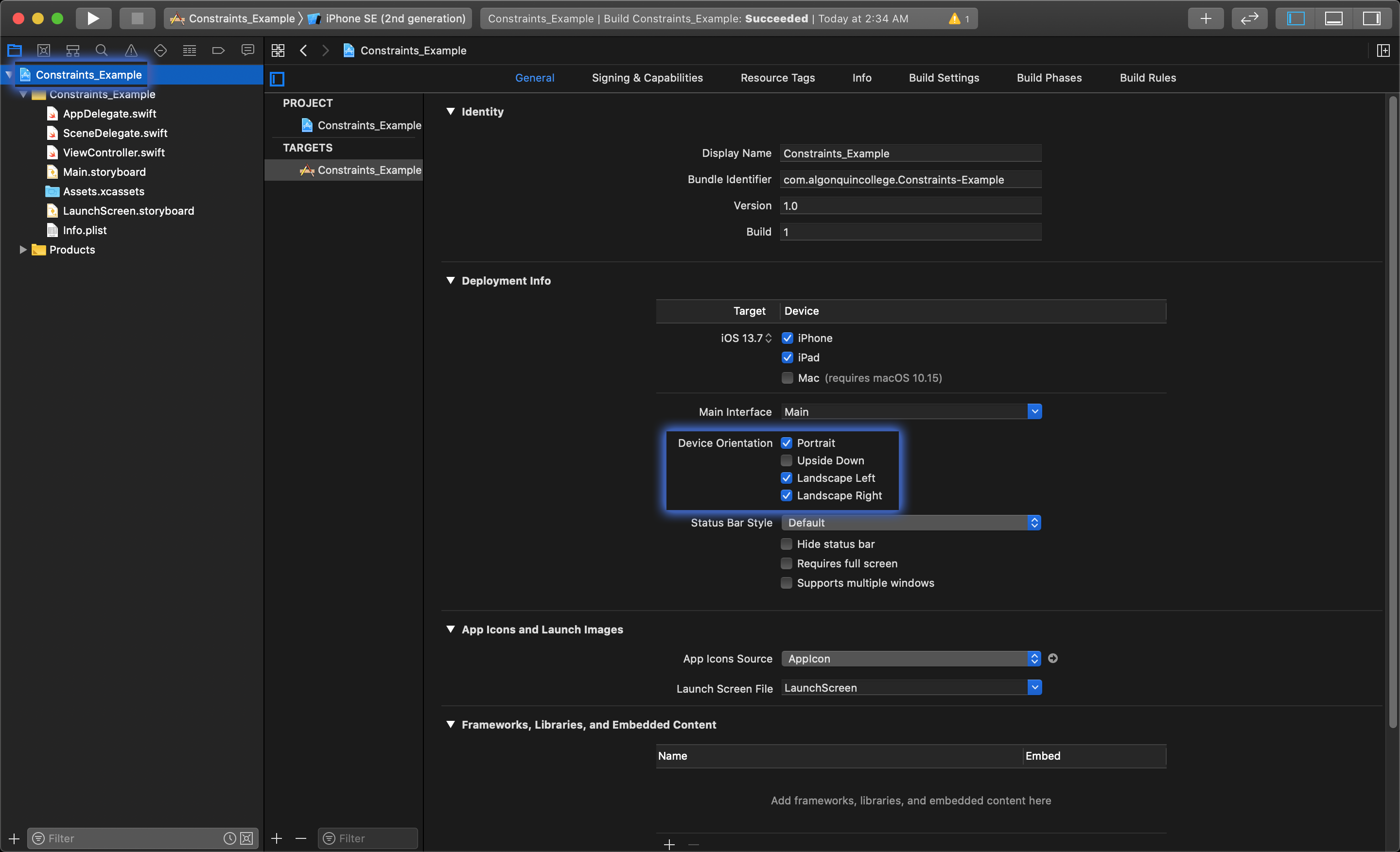
Note: Project settings can be found by clicking the blue Xcode project file at the root of your Project navigator.
In the General tab of the project settings, you can select exactly what orientation you want to allow.
Constraints and Auto Layout
When you want to take a layout you have built in Xcode and make it display in a uniform way on other devices and orientations, you will need to use an auto layout.
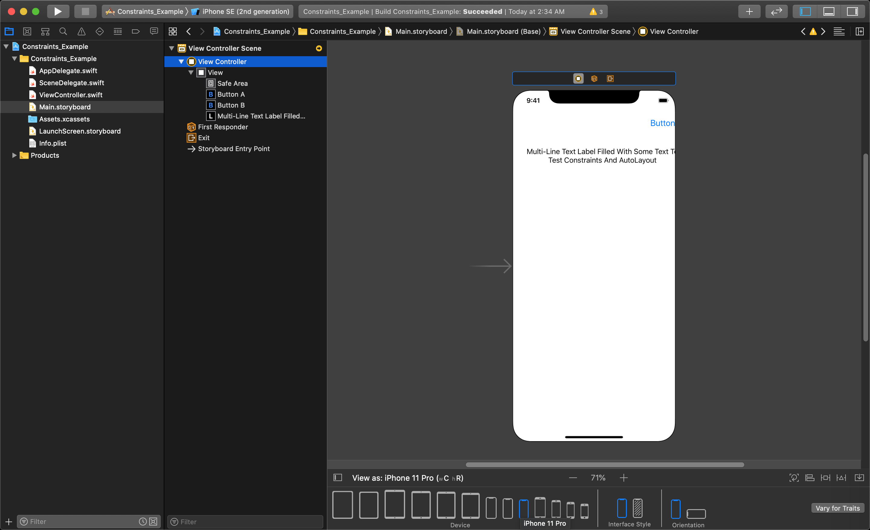
Our example project will currently shows the static layout, with each object at their original x- and y-coordinates.
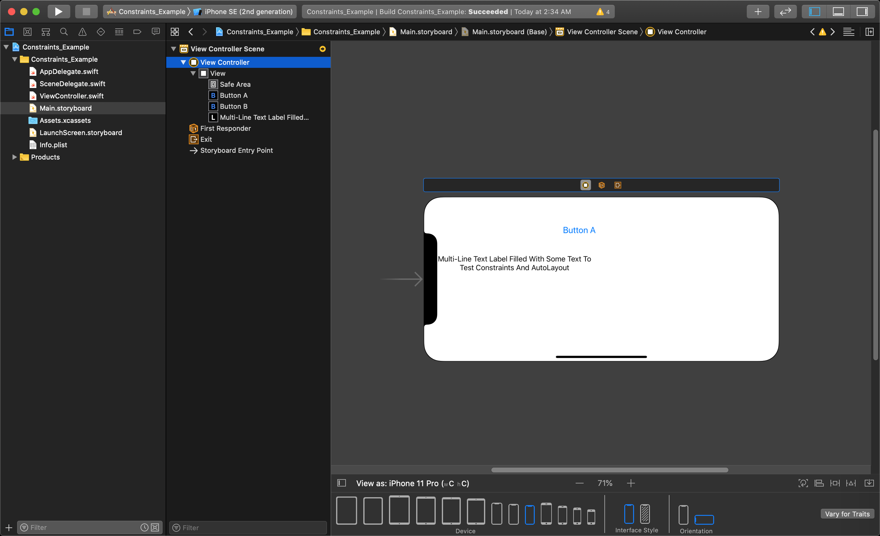
Rotating the device to landscape mode makes the UI become even less usable (e.g. Button B is fully off the bottom of the screen).
TIP
Different versions of Xcode were made with different requirements for constraints. Because of this, you may not see certain localization settings suggested when adding constraints in your version of Xcode.
Creating Individual Constraints
The auto layout system lets you make connections called constraints from each UI object to the view bounding edges of the view, or to other UI objects to pin the space between them.
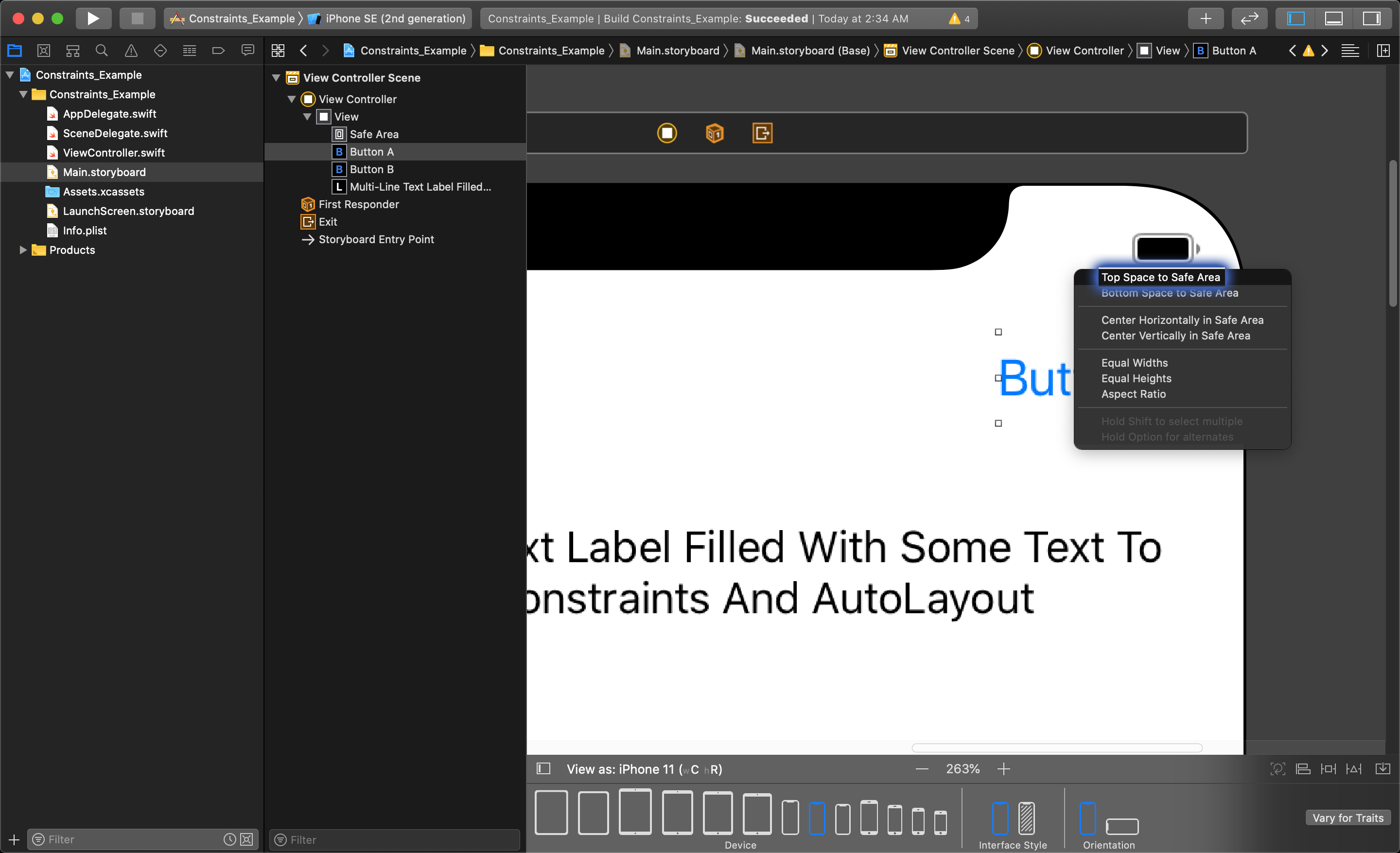
Each UI element will need constraints added to it so that the application knows where to place each object in relation to other UI elements in the layout. A constraint from the button to the top edge of the view will keep that button a fixed distance from the top of the view. This is done by holding control+mouse click and drag to the edge of the view such that the view highlights in blue, like shown below.

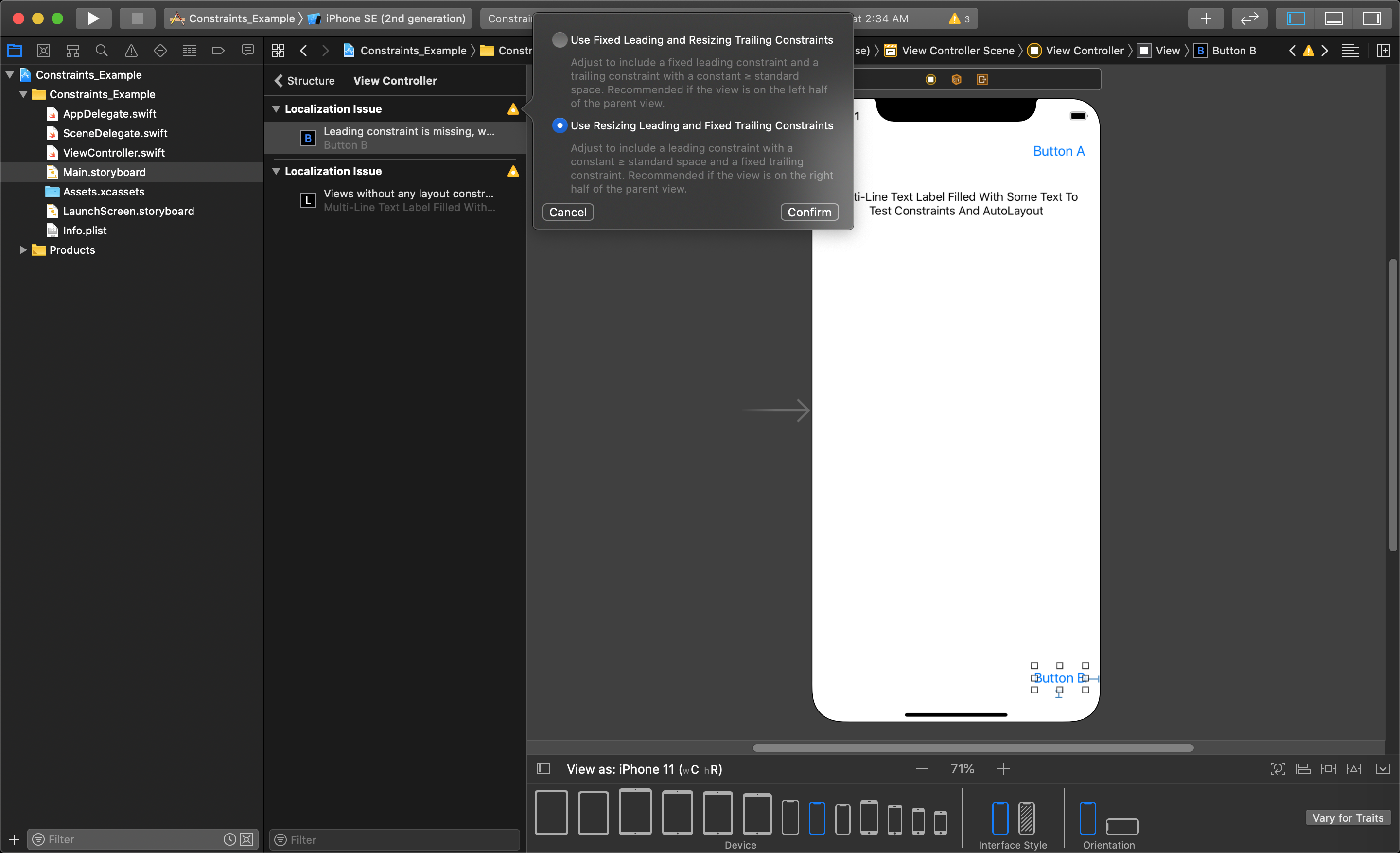
A menu will pop up letting you choose how to constrain the object. We want to pin the button to the top of the view with its current spacing, so we will need to choose 'Top Space to Safe Area'.
Next, we want to create a constraint from the same button the the right edge of the view will always keep the button a fixed distance in from the right of the view, regardless of device and orientation. This constraint will be created the same way.
After holding control+click and dragging to the right side of the view, the popup dialogue will give you the following options:
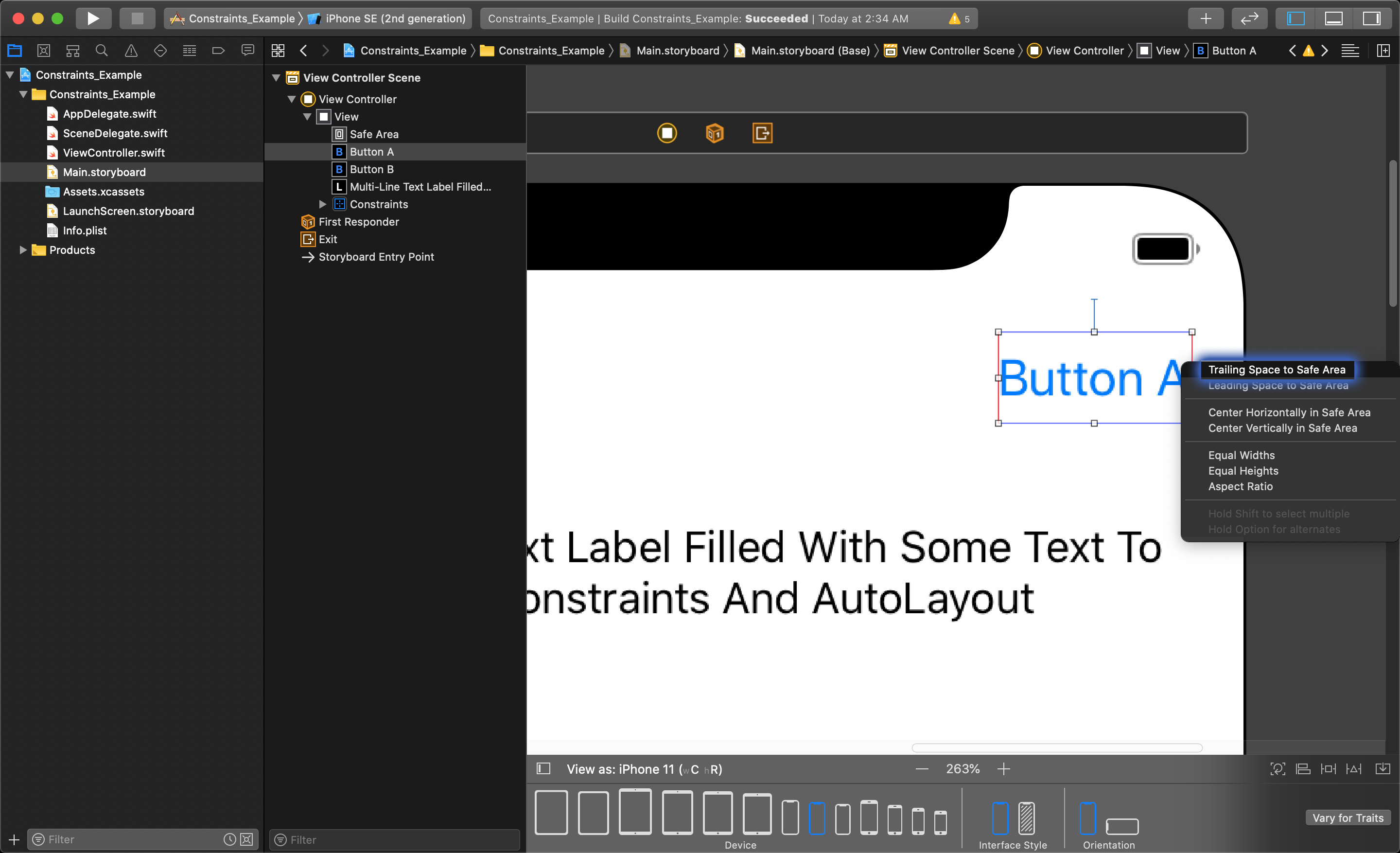
We want to choose the 'Trailing Space to Safe Area' option in this menu to keep the button pinned to the right side of the view, regardless of screen size and orientation.
TIP
Distance is measured in points, not pixels. This is to create a relative distance regardless of screen size, or pixel density.
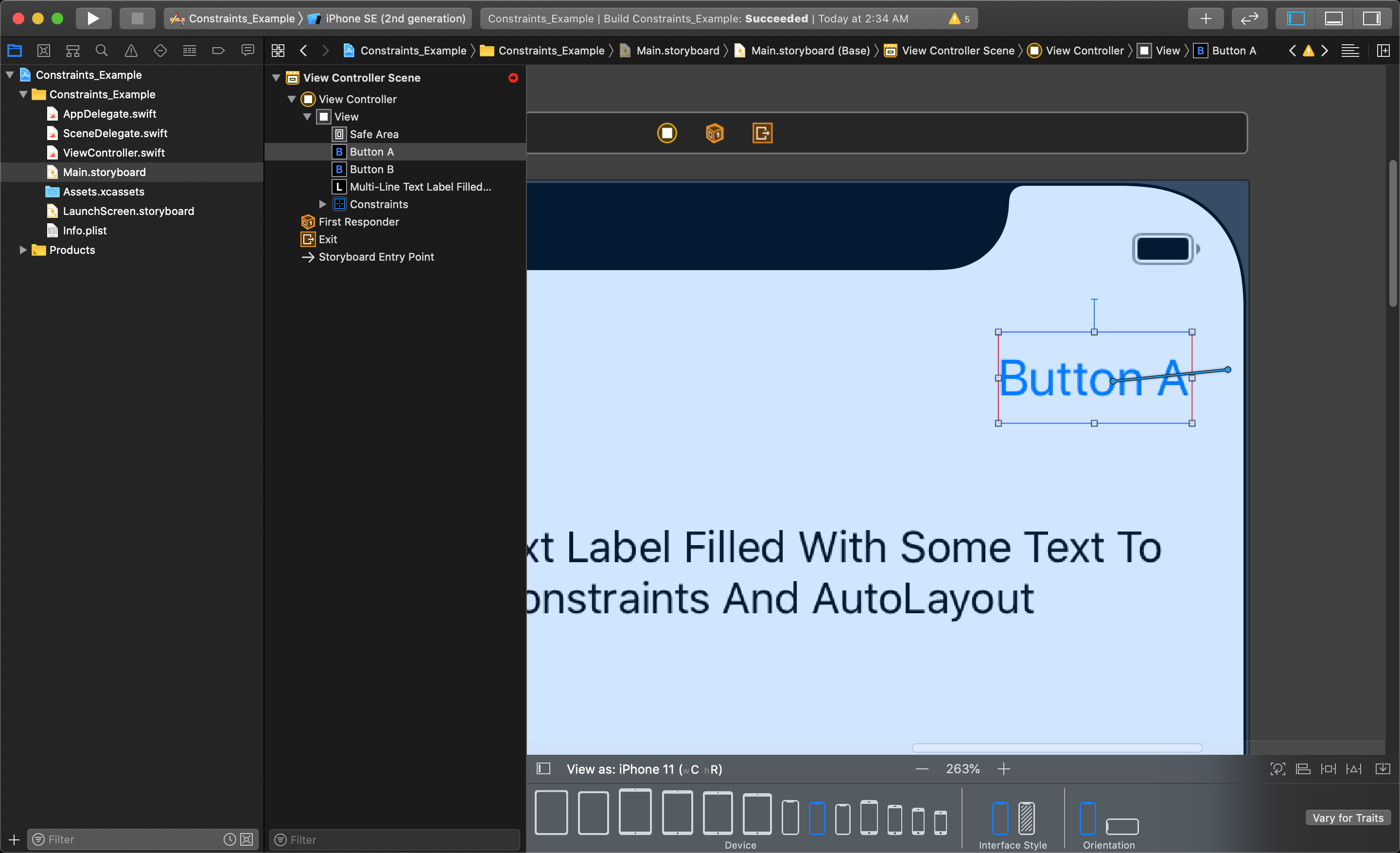
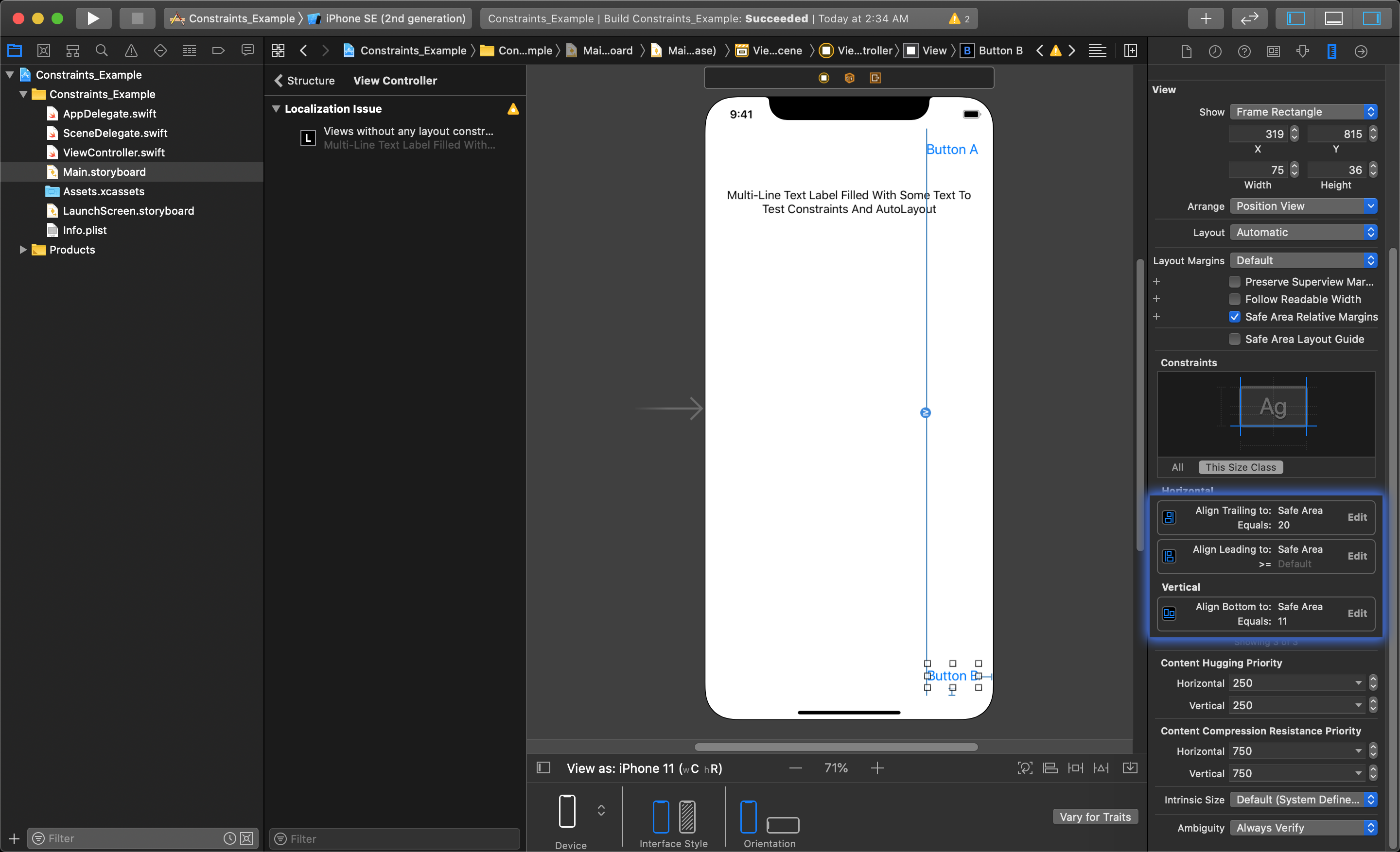
Now, you will see that a yellow warning icon will pop up in the top corner of your Document Outline.
Clicking on this yellow icon will open up the constraint debugging list.
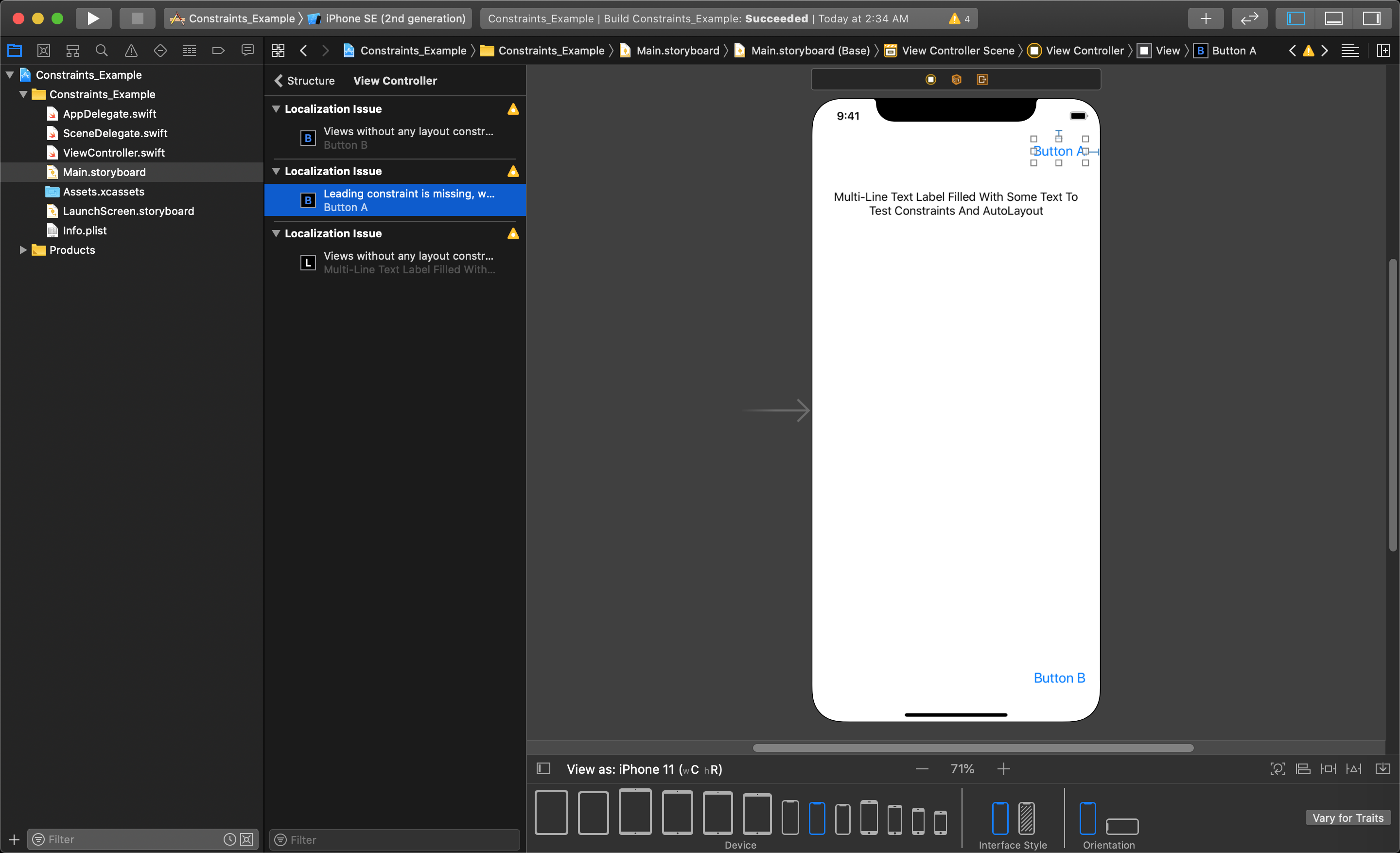
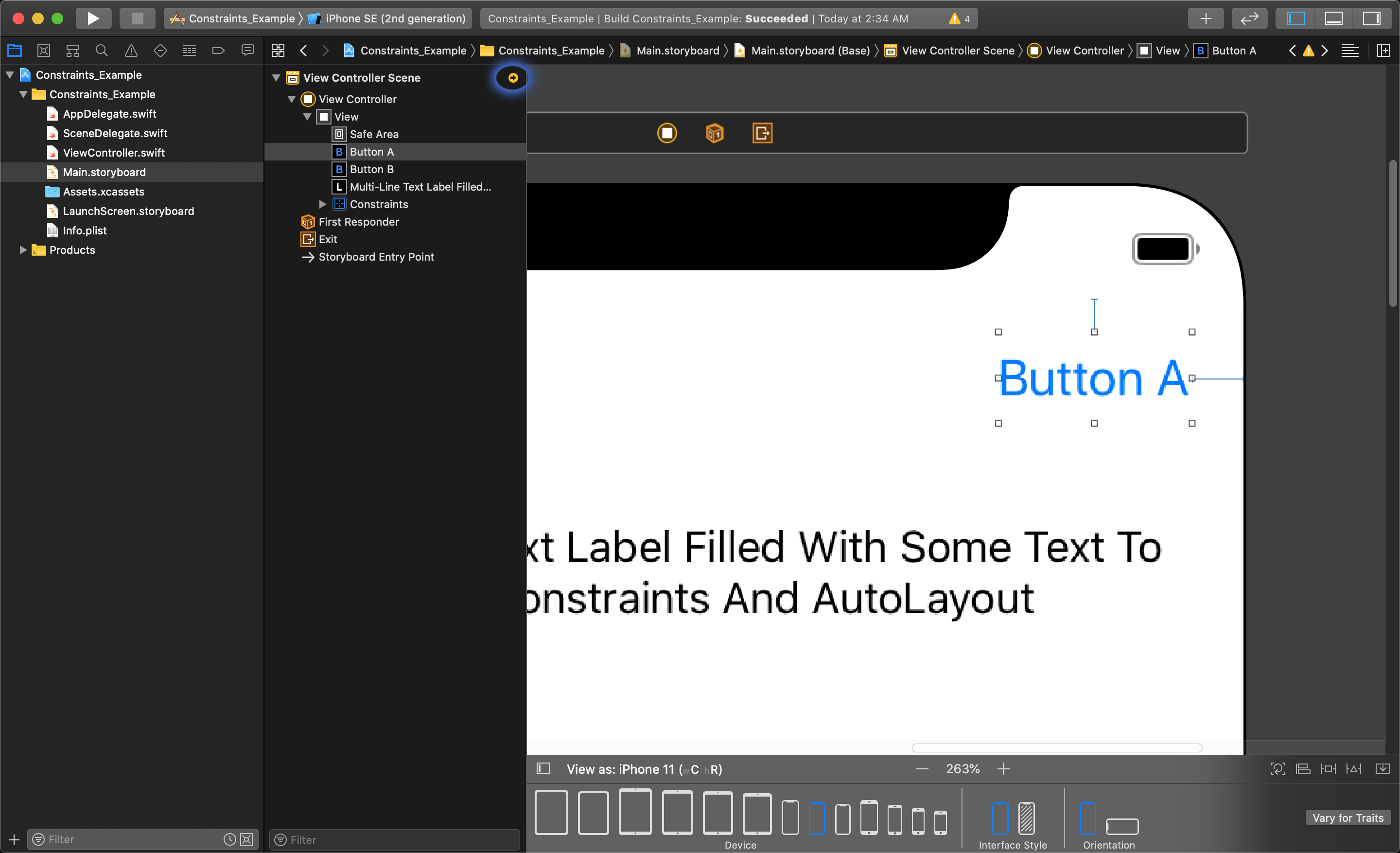
Here you will see a list of constraints Xcode has noticed is missing for any objects that have been set to use constraints. Xcode calculates a minimum number of constraints to account for all sizing scenarios, and will offer suggestions for any it thinks are missing.
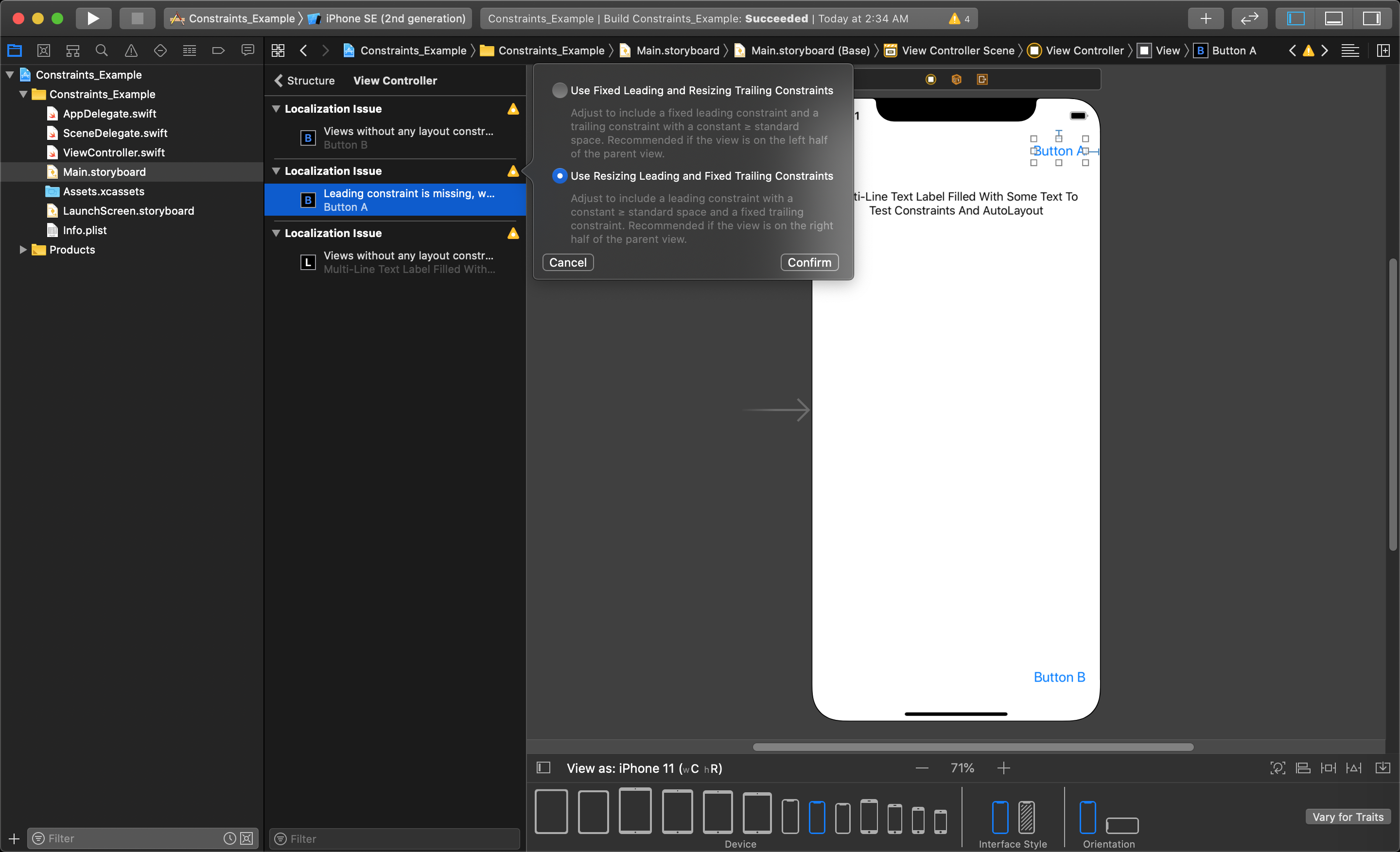
A list of suggested solutions can be found by clicking the yellow triangle beside the constraint issue in this list. In this example, we would want to set the trailing edge of the button to be fixed to the right edge of the view, so we will choose the bottom option.
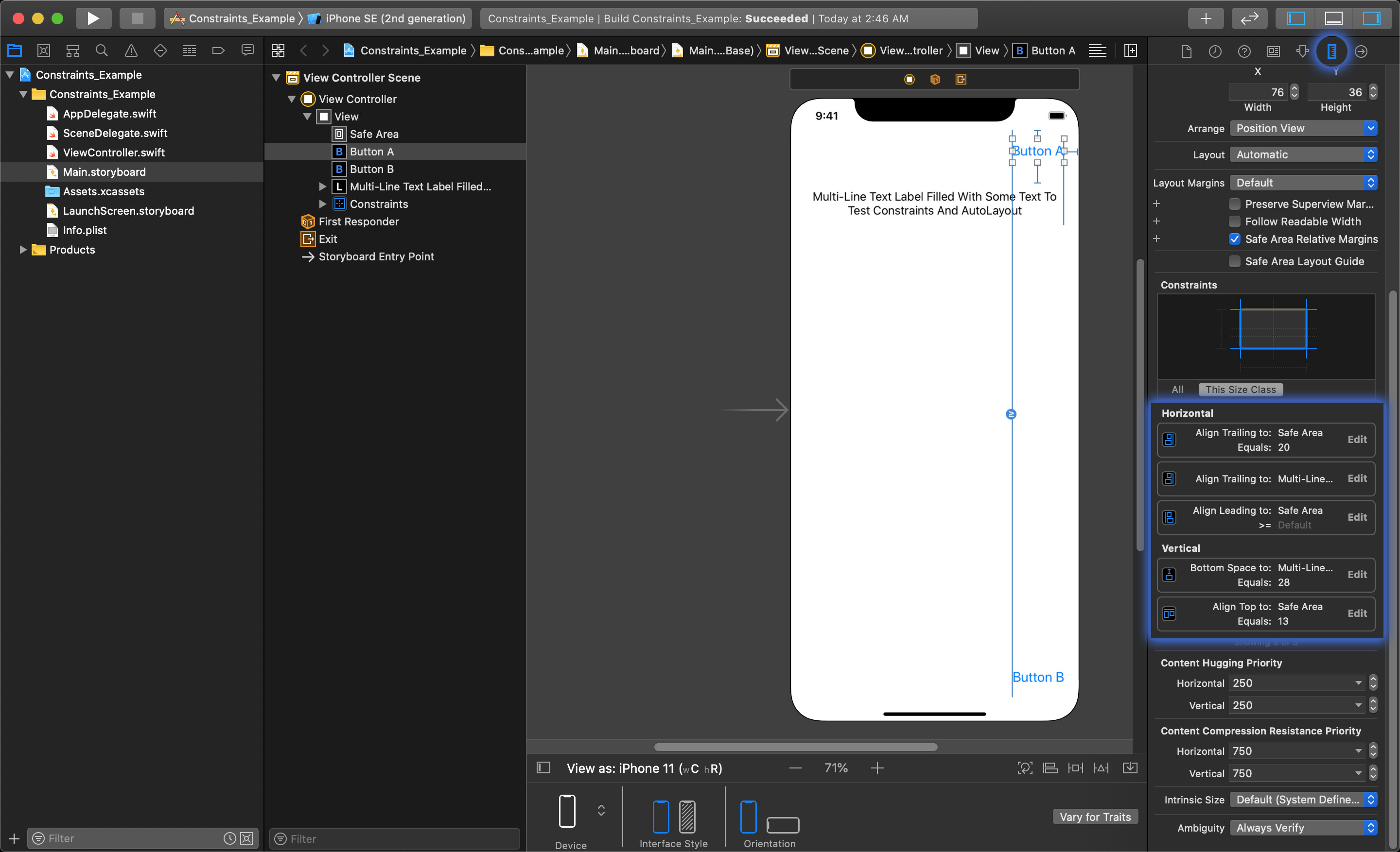
That has created a complete list of constraints to fix the top button to the upper right corner of the view. You can view all of the constraints added to the button by selecting it, and opening up the Size Inspector on the right side of Xcode (the icon circled in the image below).
Using the Add New Constraints menu
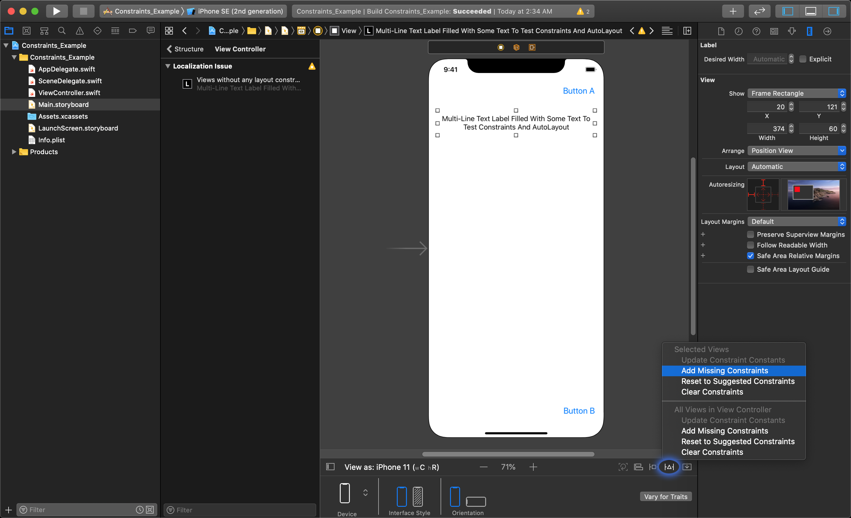
We will do the same for the bottom button, but this time we will use something called the 'Add New Constraints' menu that lets you add multiple constraints at once for a single object.
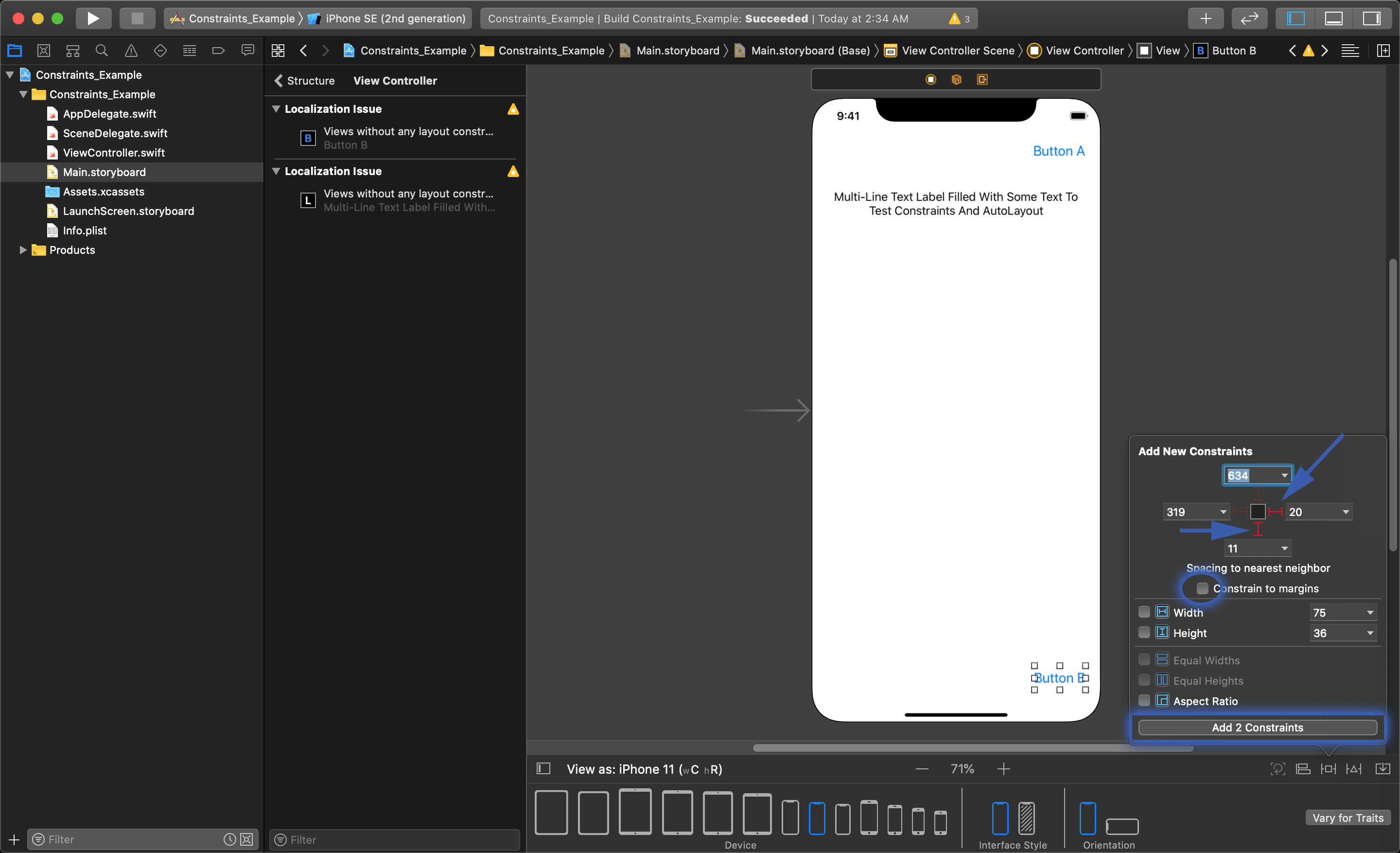
After selecting the bottom button, we will click on the square icon at the bottom of the editor in Xcode to reveal the Add New Constraints menu. The first thing you should do is turn off the 'Constrain to Margins' option. Then, you can select the little red constraint icons representing the different sides you want to constrain depicted around the square icon.
This has set the parameter of the constraints you want to add, you then need to click the 'Add Constraints' button at the bottom of this menu to actually create the new constraints. Next we will use the Auto Layout suggestions to add the left constraint the same way as before.
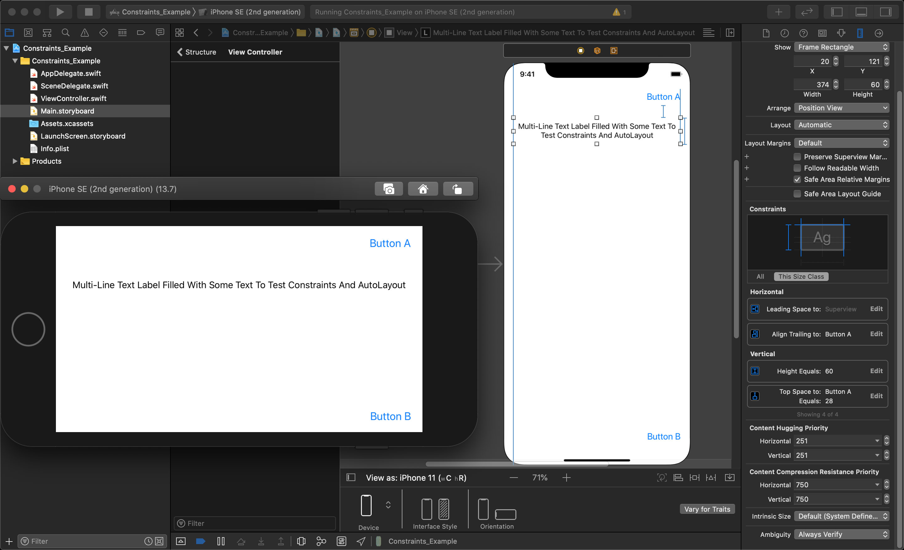
We can open up the Size Inspector again to see the list of constraints added.
Using Resolve Auto Layout Issues menu
The last way you can add constraints to a UI object is to just let Xcode add what ever constraints it suggests as a best fit. For this, we will select the text Label and open the 'Resolve Auto Layout Issues' menu by clicking the little triangle icon shown int the image below.
There are two sections in this menu, one above the other letting you resolve issues for the objects you have selected, or for all the objects in the view. Because we have already set up our other constraints, we will choose the 'Add Missing Constraints' in the 'Selected Views' options.
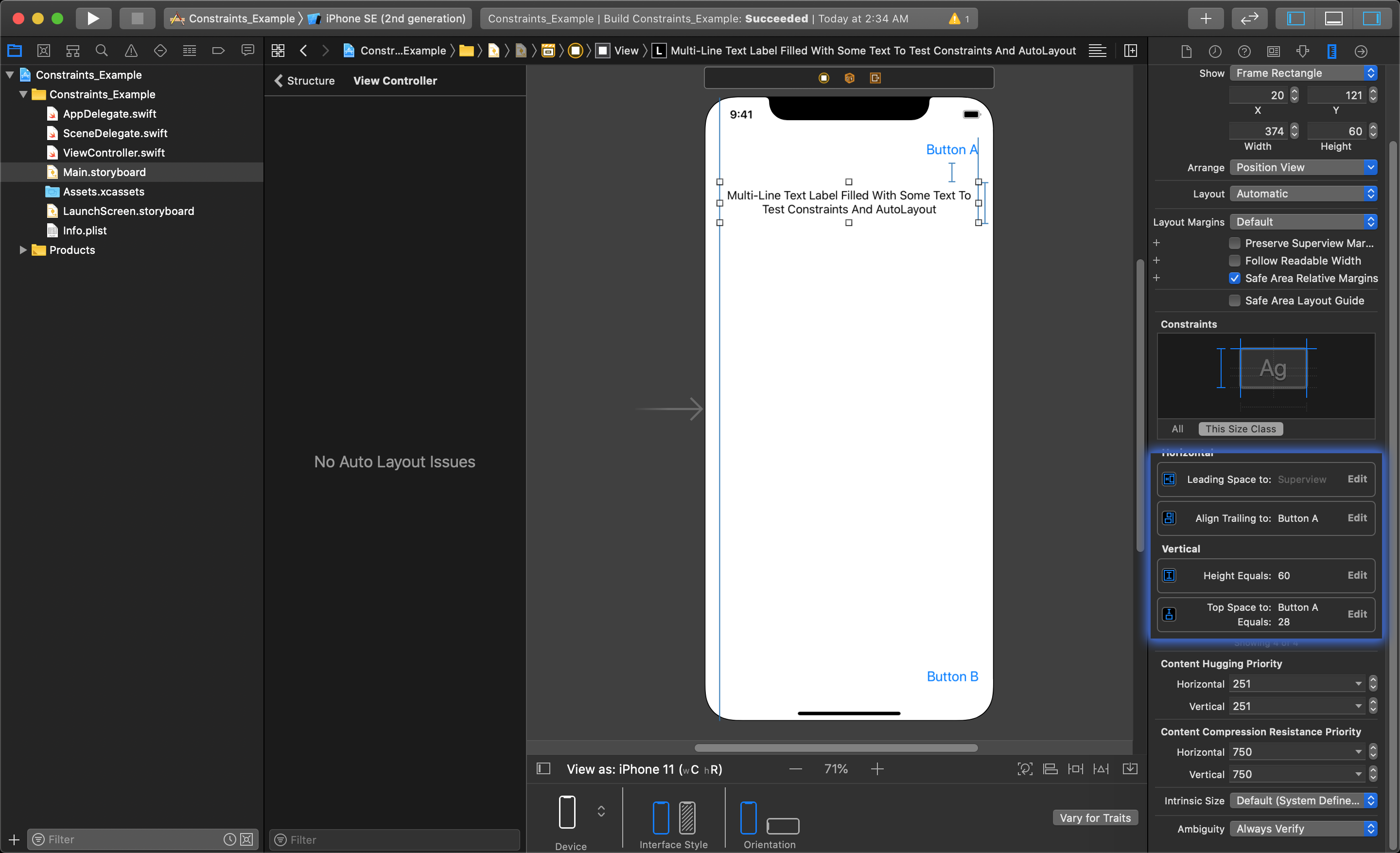
In the Size Inspector we can now see a list of all the constraints that this option added.
In the image below, you can see this application running in the simulator with the orientation rotated to landscape. The buttons are now pinned to the corners of the view, and the label stretches to fill the width of the view.
The following videos will show you the fundamentals for setting up constraints for your UI elements in Xcode:
Pluralsight
Positioning View Objects with Constraints
Adding and Editing Auto Layout Constraints
Troubleshooting Auto Layout Constraints
Here's a Pluralsight course dedicated to auto layout fundamentals
Lynda
Center an Object in Portrait and Landscape
Change the size of an object dynamically
Change a Layout with Device Orientation