Constraints for Different Size Classes
Introduction to Size Classes
In iOS development, there are many shapes and sizes of devices that you can build for. In order to build an application that looks good and functions well for different screen sizes and orientations, you will need to learn to build an adaptive layout. You have seen how to add constraints on UI objects to build an auto-layout, but you may notice that your layout that looked good on an iPhone 8 looks sparse and clumsy on an iPad. The same layout will also be unusable on an iPhone 8 in landscape mode if the bottom portion of the layout is cutoff below the bottom of the screen.
So, you need a way of changing the layout of your application for different sizes of screen and what orientations your application might be running on. The solution Apple created lets you change the layout based on something called Size Classes.
Size Classes are a way of arbitrarily describing the size of a screen - namely the width and height of any screen, and screen orientation. When you open your storyboard in the Xcode editor, you will see an option that displays View as: iPhone 8 (wC hR). Clicking this option lets you choose different devices and orientations to display the views in your storyboard as. This is also where you can see the Size Class information displayed for each device (and orientation).
For all iOS devices, the Sizes Class defines the height and width as being Compact or Regular sized. These are arbitrary units of measures that define a general amount of size for width and height regardless of screen size or pixel density. The iPhone 8 in portrait orientation has a Size Class of (wC hR) or "width = Compact, height = Regular", in fact all of the models of iPhones in portrait mode have a Size Class of (wC hR).
All iPhone models before iPhone 8 Plus displayed in landscape orientation has a Size Class of (wC hC), whereas the iPhone 8 Plus has (wR hC). All iPads have (wR hR) in both portrait and landscape orientation. The following table shows some of the current iOS devices in both orientations and their associated Size Class values.
| Device | Orientation | Width | Height |
|---|---|---|---|
| iPad | Portrait | R | R |
| iPad | Landscape | R | R |
| iPhone | Portrait | C | R |
| iPhone | Landscape | C | C |
| iPhone 8 Plus | Portrait | C | R |
| iPhone 8 Plus | Landscape | R | C |
Installing/Uninstalling Constraints for different Size Classes
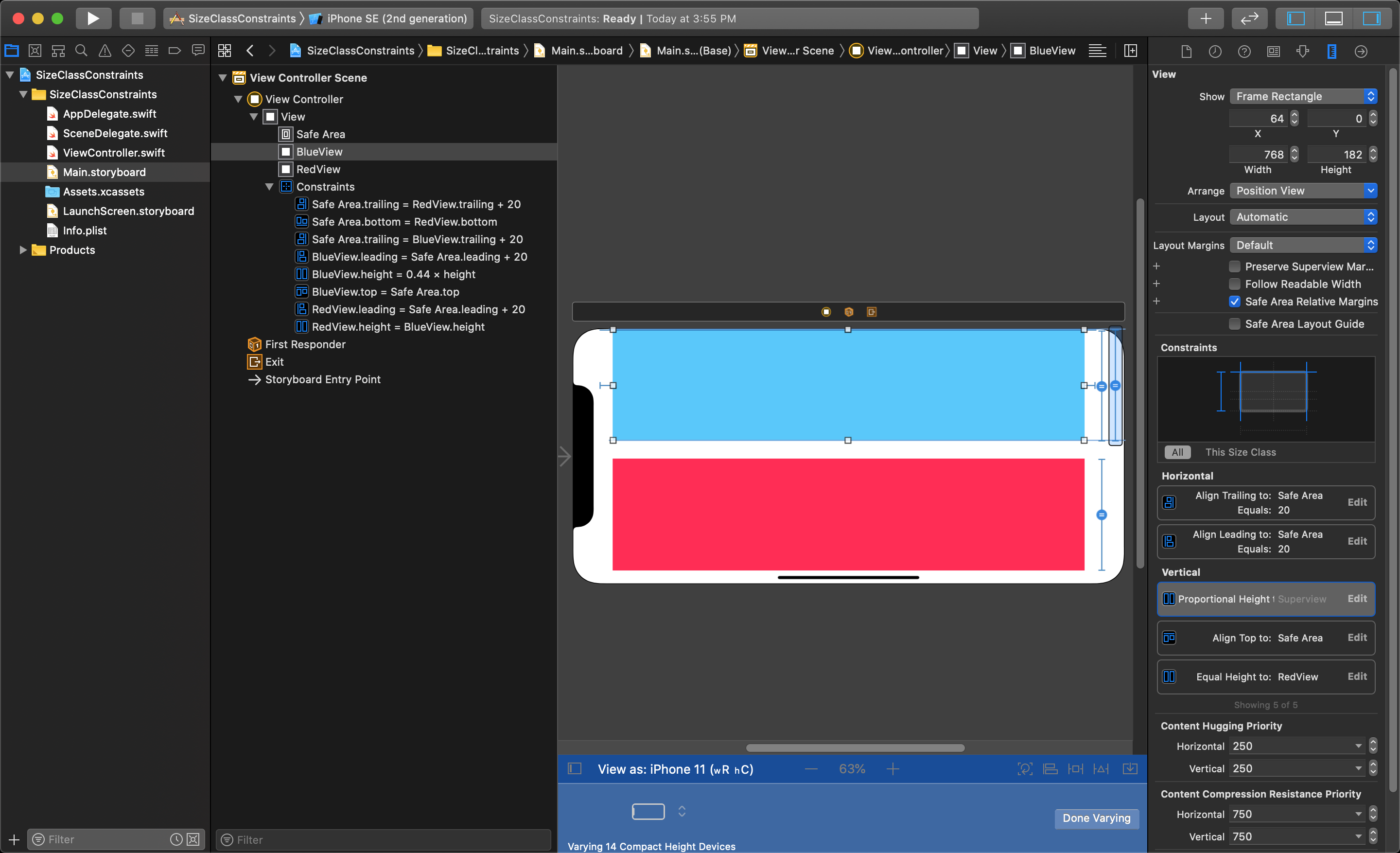
For this lesson, we will look at an application that displays two basic views vertically in portrait mode: one blue one red. If you need help remembering how to connect constraints to a UI object, review last week's lessons.
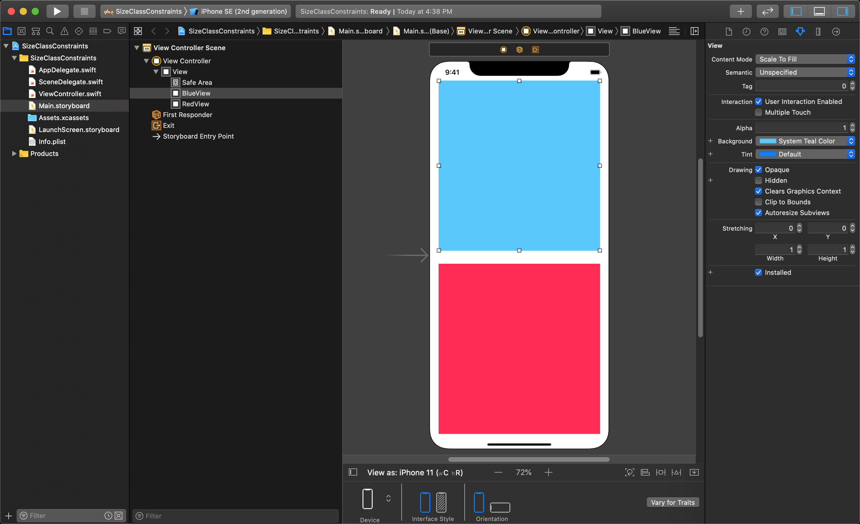
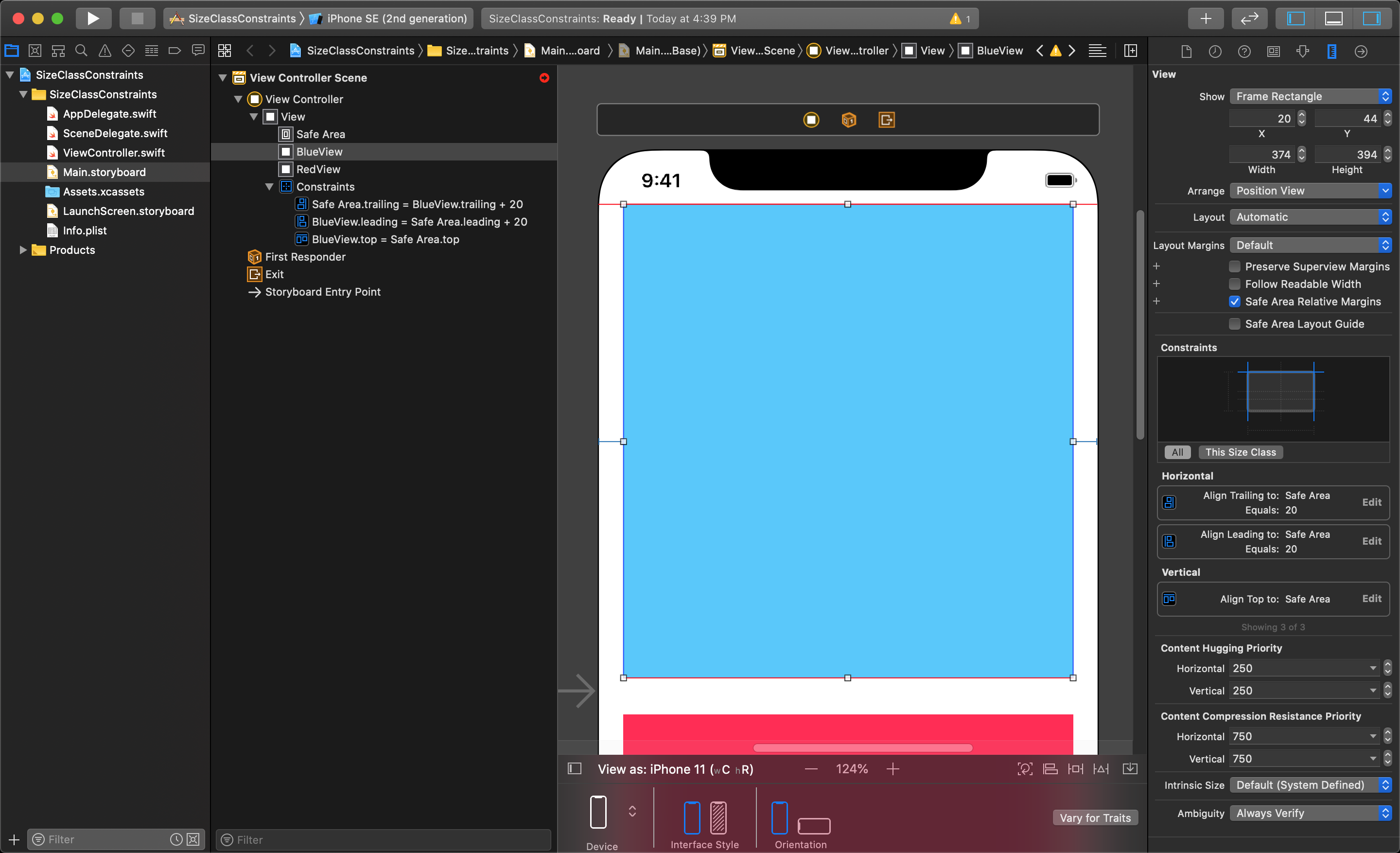
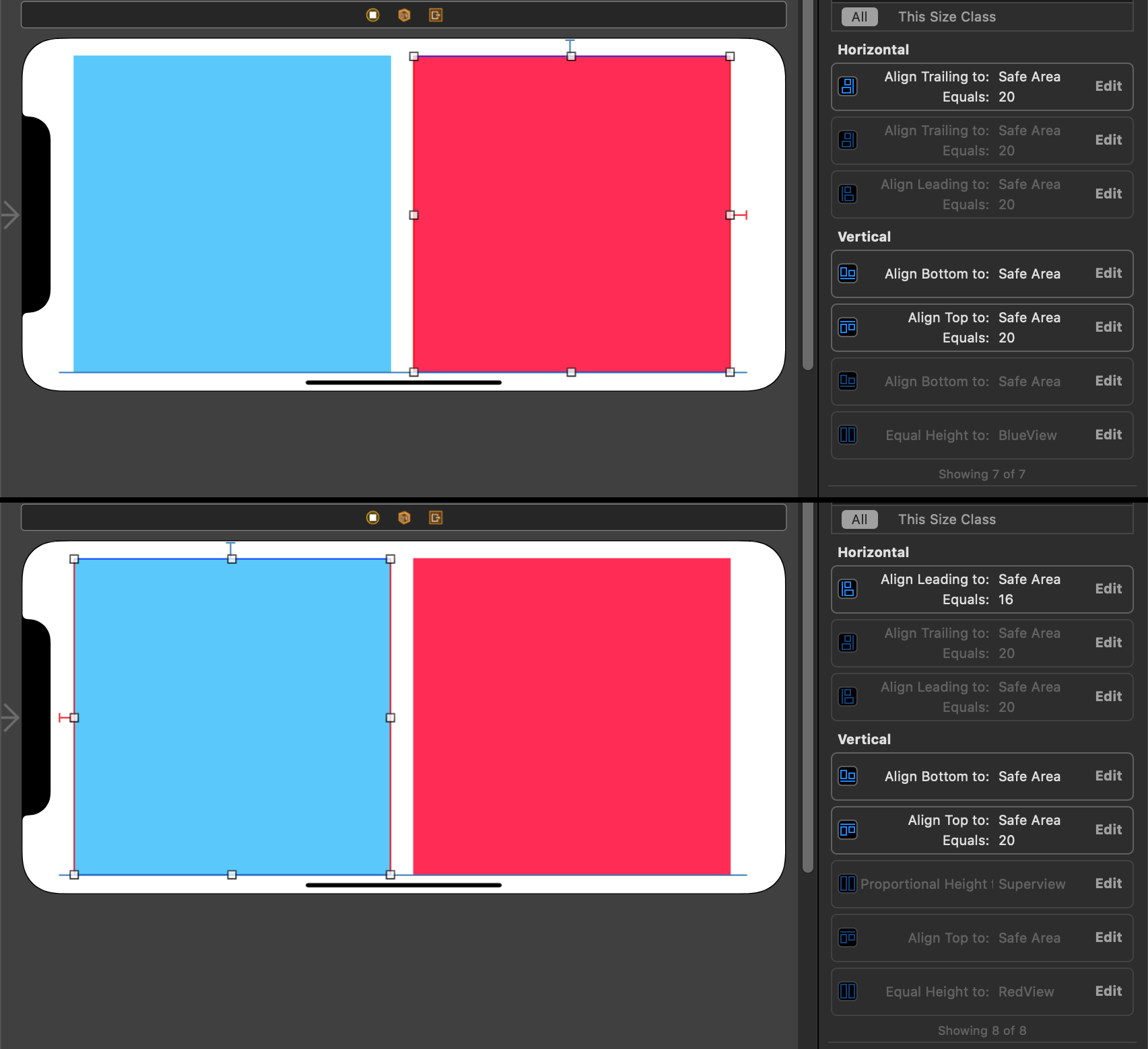
We will add constraints to the top view's Leading, Top and Trailing Edge to "Safe Area".
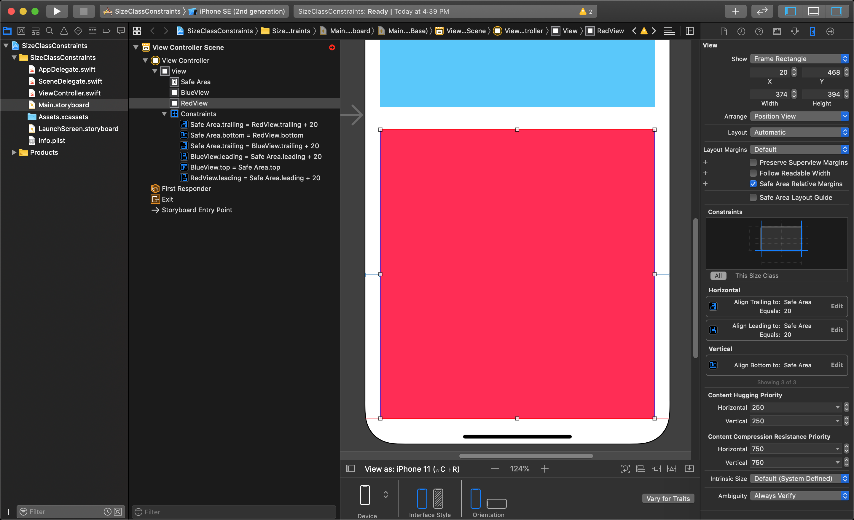
Then add constraints to the bottom view's Leading, Bottom and Trailing Edge to "Safe Area".
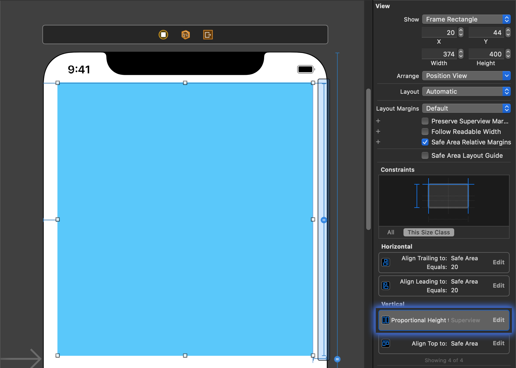
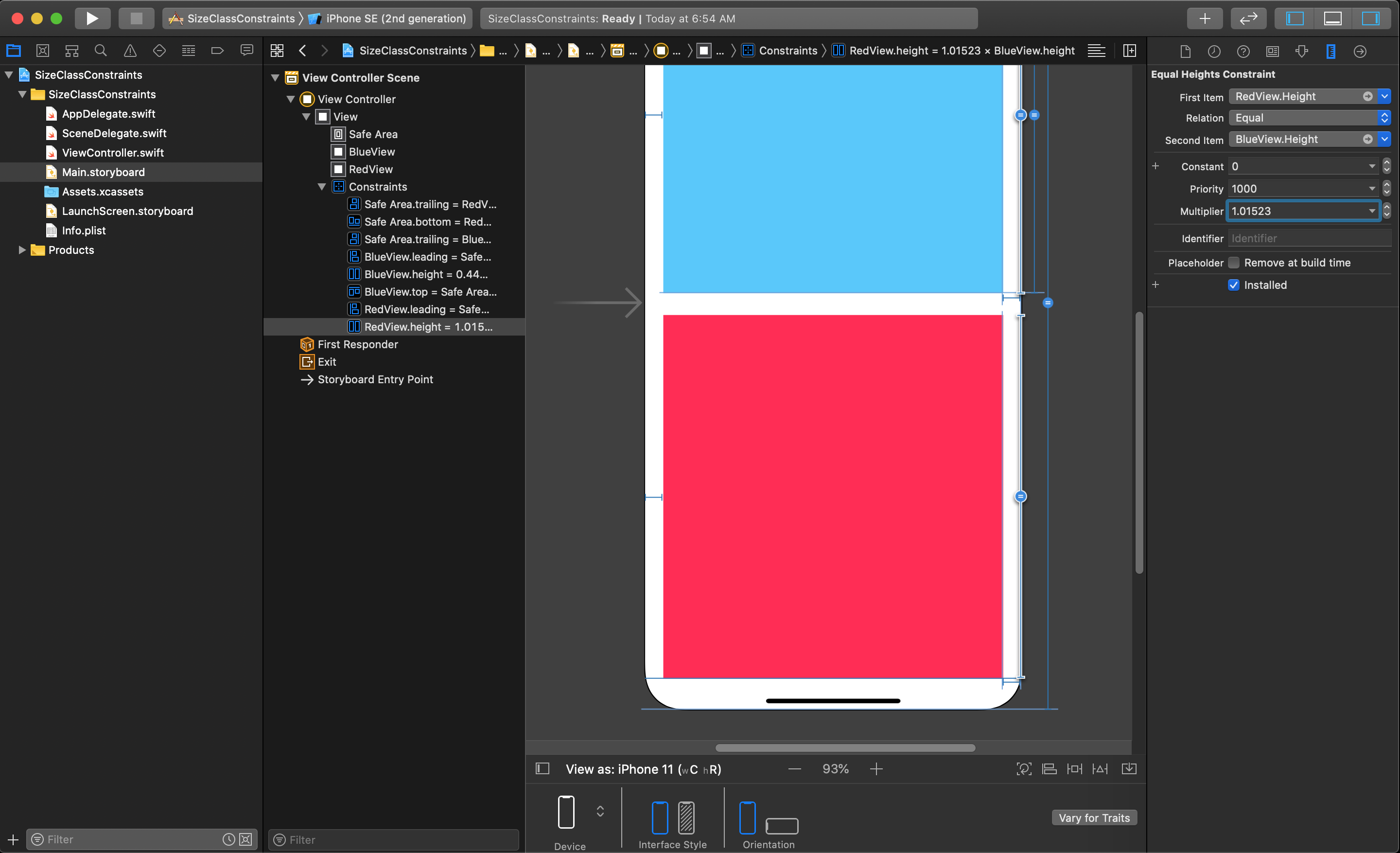
Next, make the top view's height equal to the main view's height.
Then, locate this constraint in the Size Inspector and double-click on it to open the parameters of the constraint (don't click the edit button).
NOTE
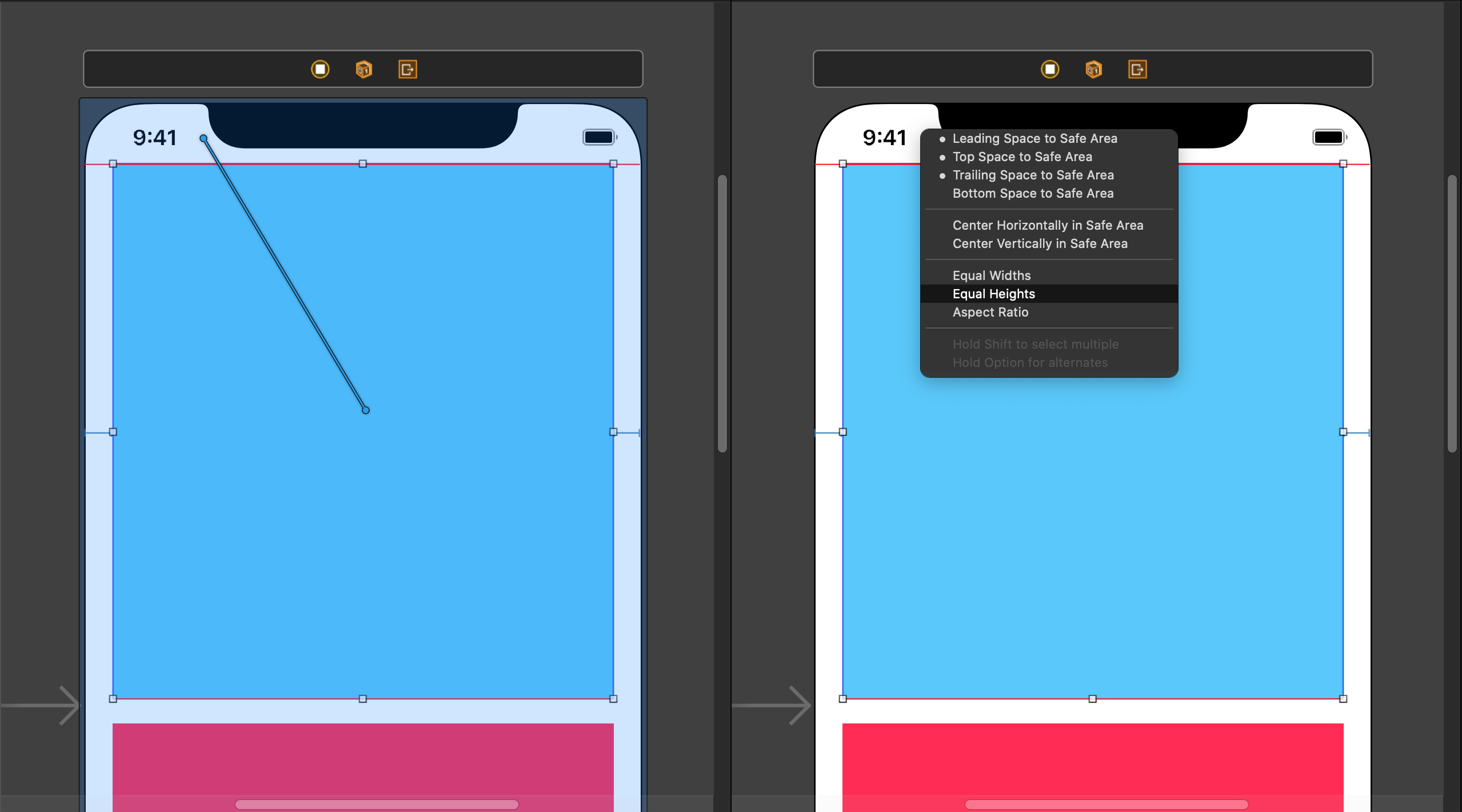
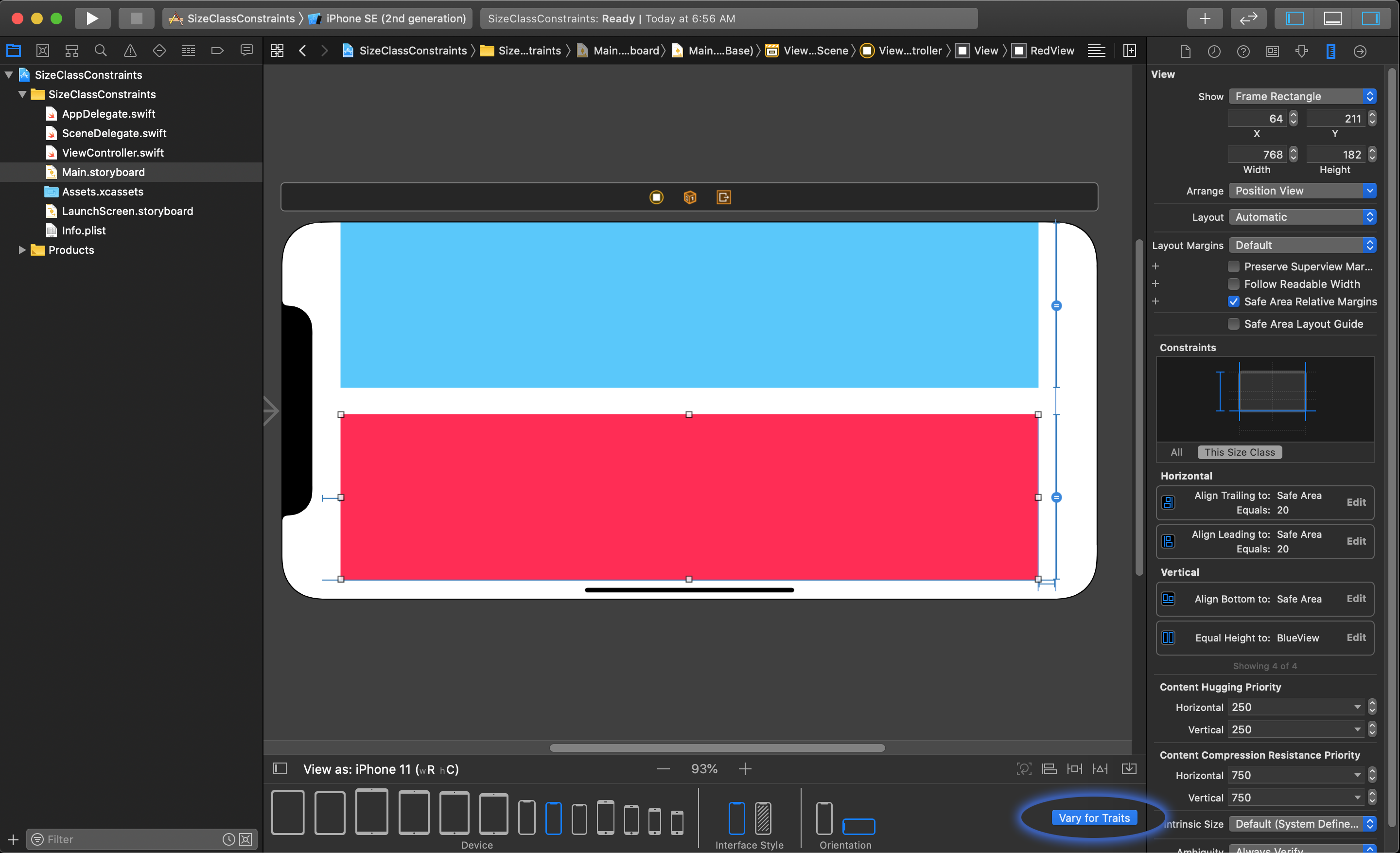
You can also open the parameters the constraints by clicking on each constraint in the Document Outline. You can see the location of the constraints in the Document Outline in the left side of the Editor in the image below.
This will show you the parameters for that specific Equal Heights constraint in the Size Inspector on the right.
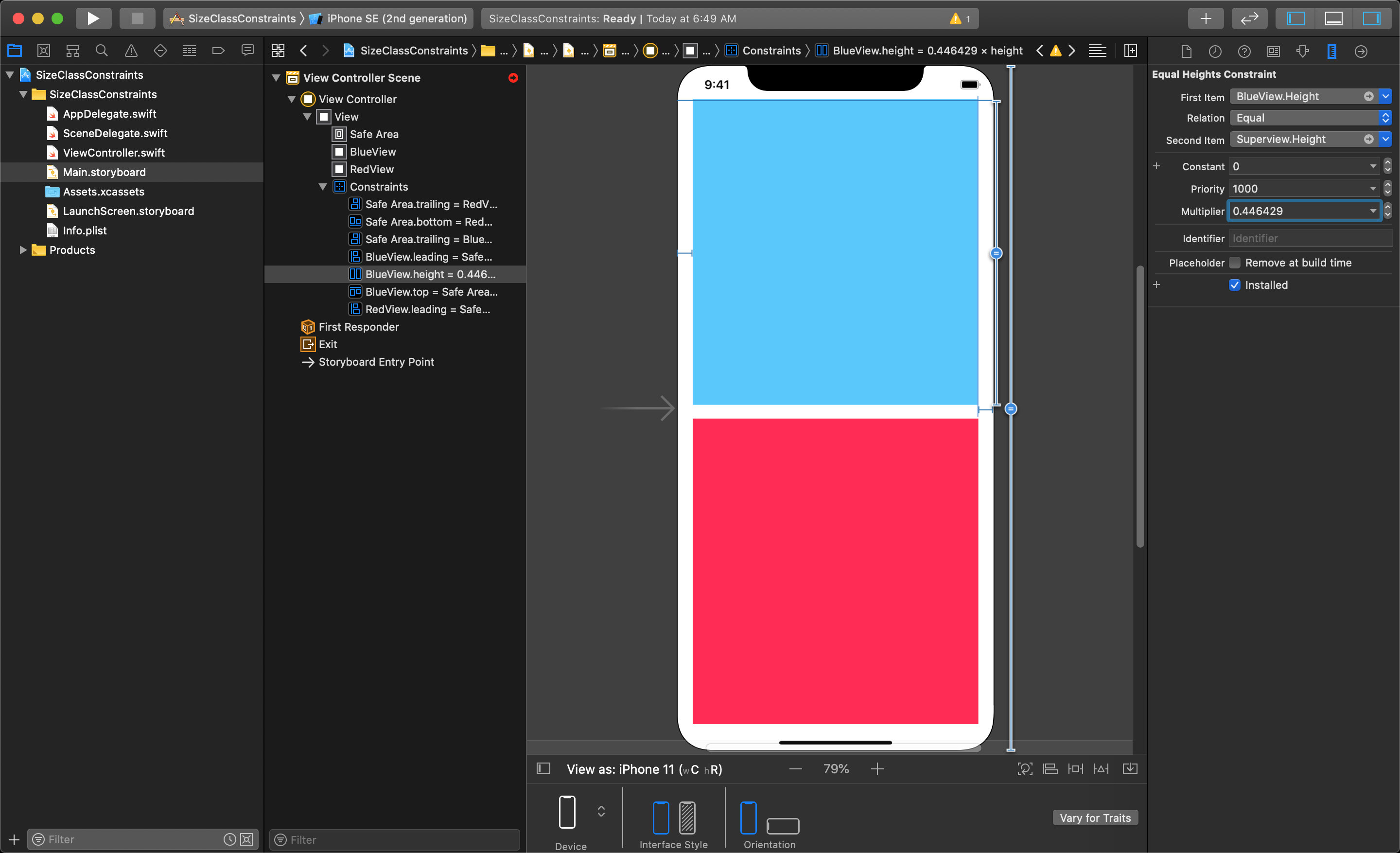
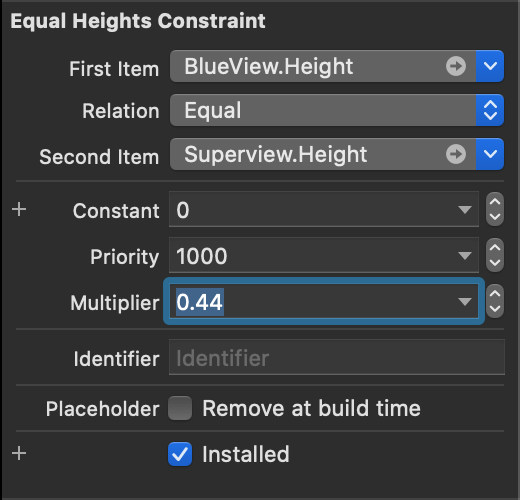
You will want to set the multiplier to about 0.44 from its current value (just to keep the numbers simple). This sets the top view to be a little bit less than half the height of the Superview.
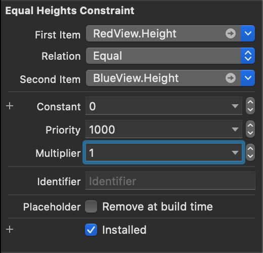
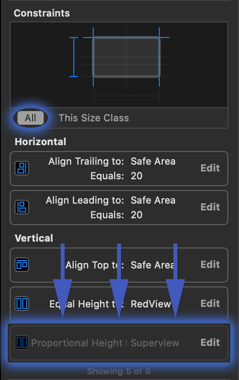
Then, set the bottom view's height equal to the top view, so if the top changes on a different device the bottom will always be the same.
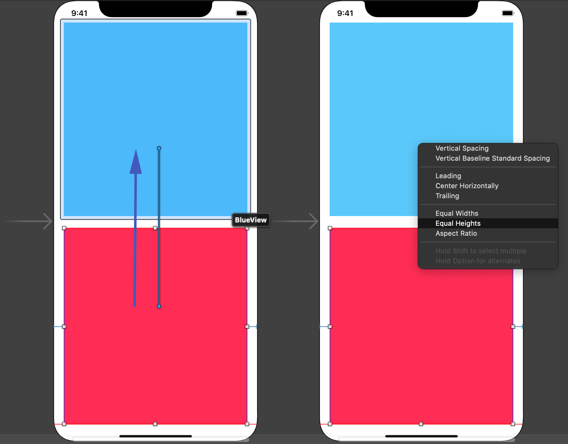
Now double-click this new Equal Height constraint in the Size Inspector on the right to edit the values.
You will need to set the multiplier to 1 if it is not already. This sets the bottom view to be the exact same size as the top view.
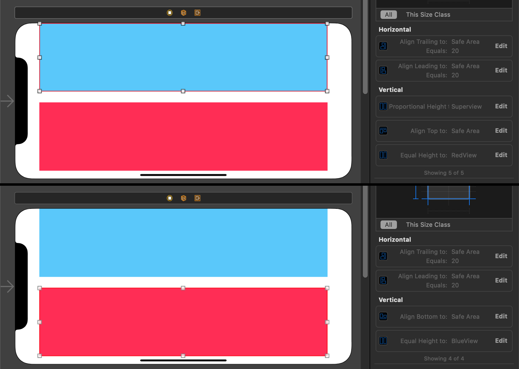
This finishes the constraints for this layout in portrait mode. However, if you switch to landscape mode the layout looks very short and wide, but this should be expected because of the way the constraints have been set up.
Adding a Layout for a Different Size Class
To add constraints for a different Size Class, start by switching to that view in the storyboard within the editor. Then, at the bottom of the editor, click on the button called Vary for Traits (circled in the image above). This will show a pop-up dialog that lets you choose to modify the layout based on the the height (or width) change being detected. For the iPhone 8, the Size Class in portrait mode is (wC hR), while in landscape it is (wC hC), so the height is what changes and, therefore, needs to be selected. After selecting, you simply click outside the dialog to close it.
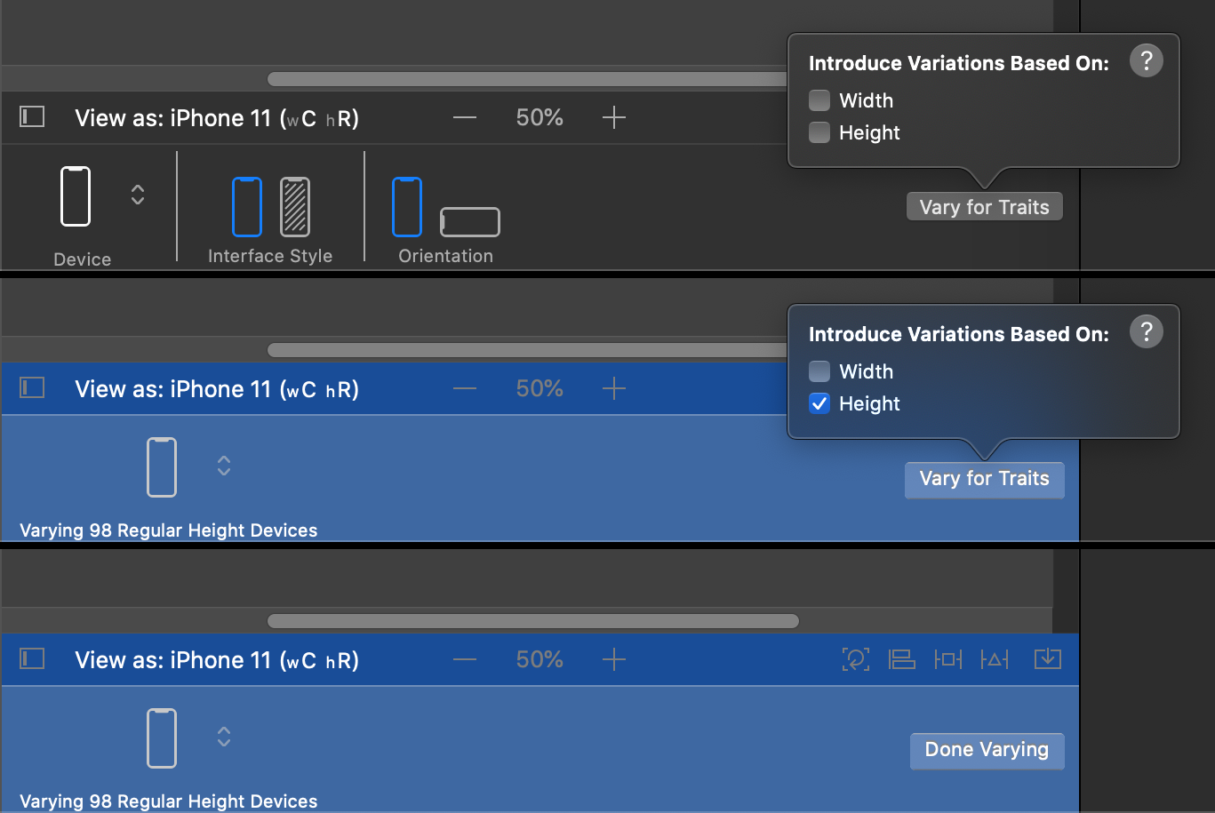
You will see the bottom bar has turned blue, indicating you are currently editing an additional Size Class.
In this mode you can uninstall the constraints related to portrait mode. To uninstall the constraints for each UI object, select each constraint in the Size Inspector and press delete button on your keyboard. You will see that the constraint does not disappear, instead it gets greyed out and is re-ordered at the bottom.
NOTE
You can also uninstall a constraint by opening the Attributes Inspector after clicking on each constraint in the Document Outline. You will see a check box at the bottom of each constraint indicating if it is installed for the different size classes you have setup.
You need to uninstall all of the constraints for each of the views we want to rearrange in the layout.
WARNING
You will only see the greyed out 'uninstalled' constraint when you are viewing All constraints, instead of just of This Size Class constraints. You can see this option circled in the image above.
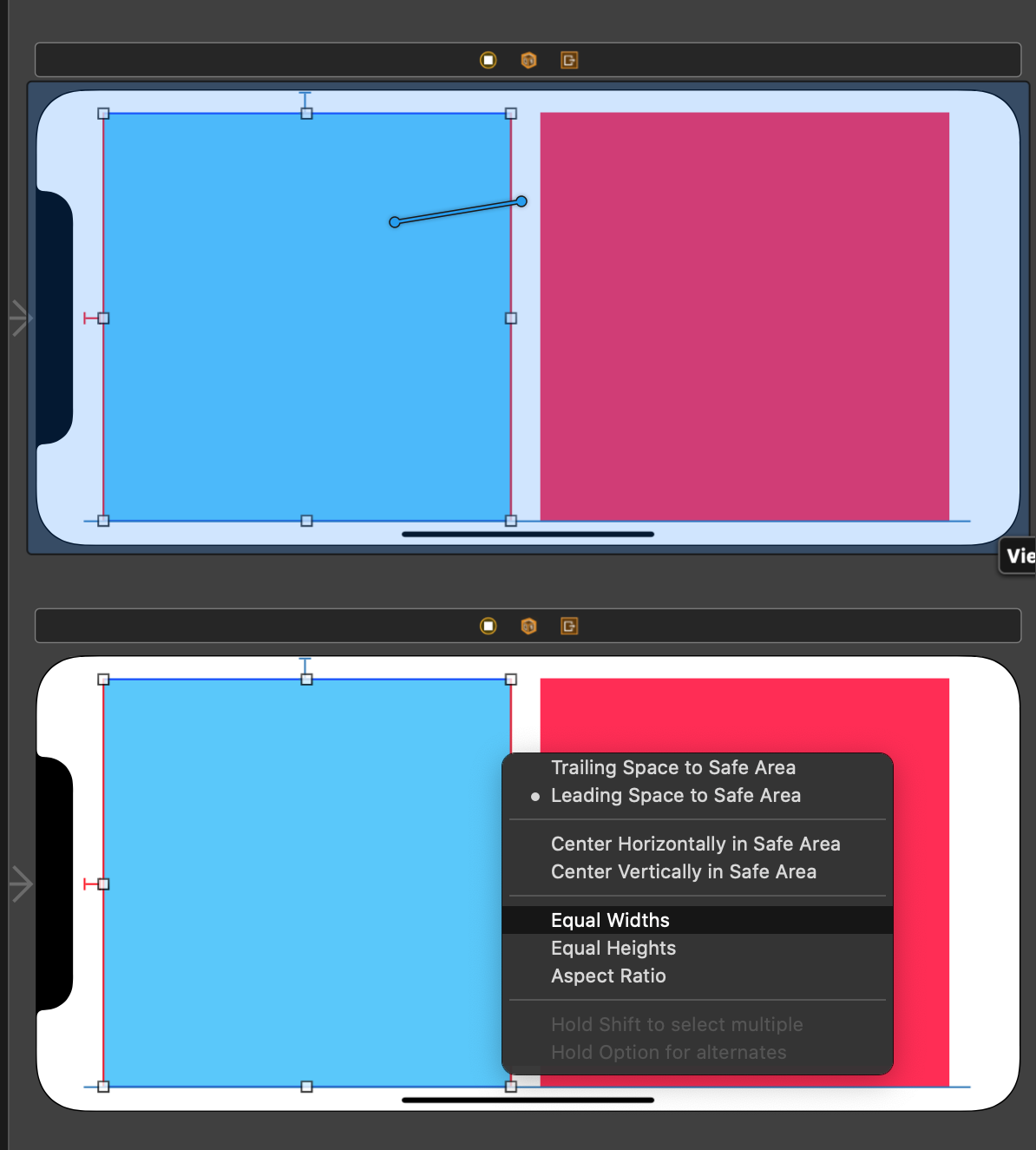
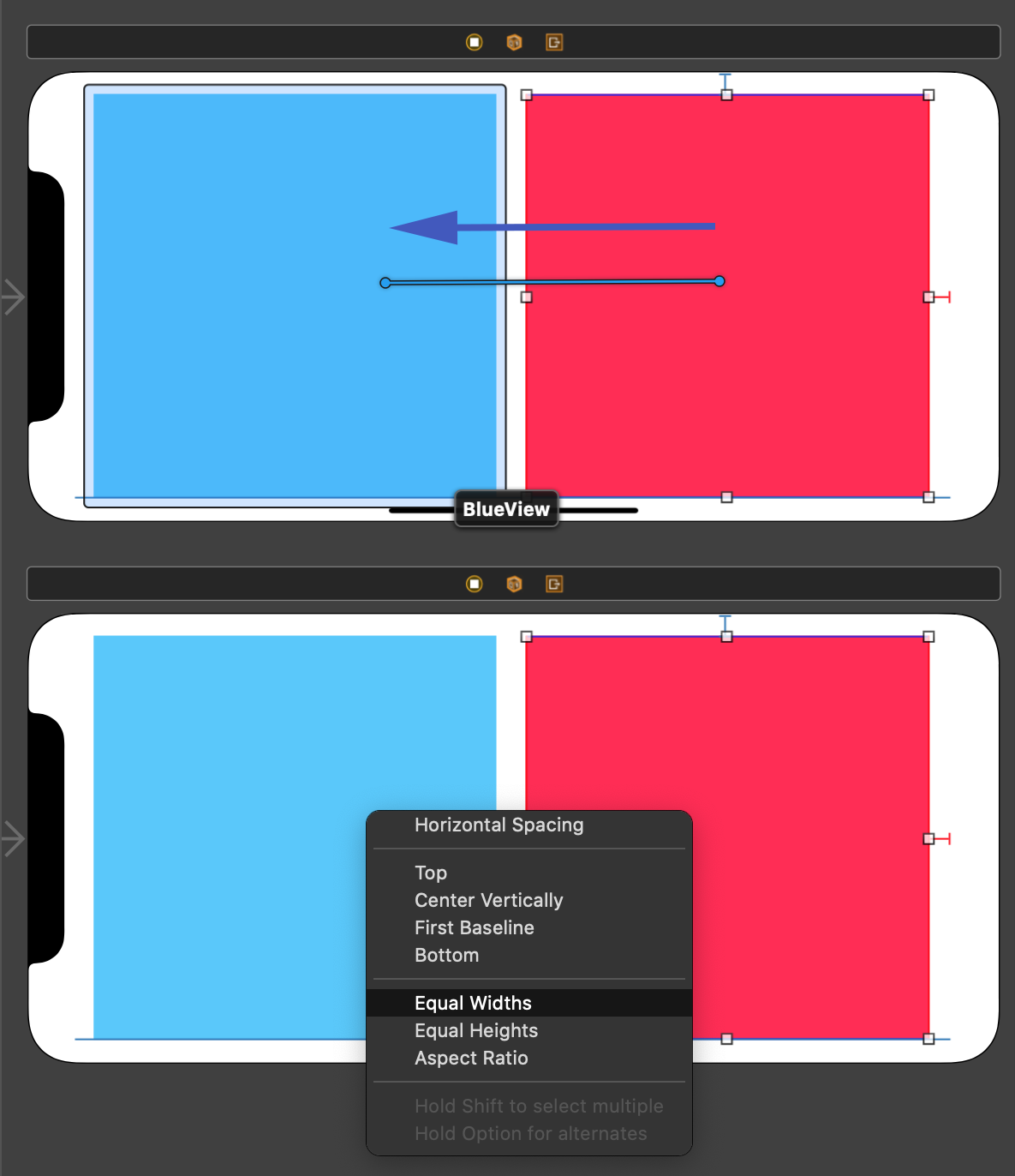
Next, you can rearrange and resize the views in the landscape layout. This is when the blue view from the top can be placed on the left, and the red view to the right.
We then need to do a similar job, installing (adding) constraints to these views. The blue view on the left will need the Top, Leading, and Bottom edges set to the "Safe Area". The red view to the right needs the Top, Trailing, and Bottom edges connected to the "Safe Area".
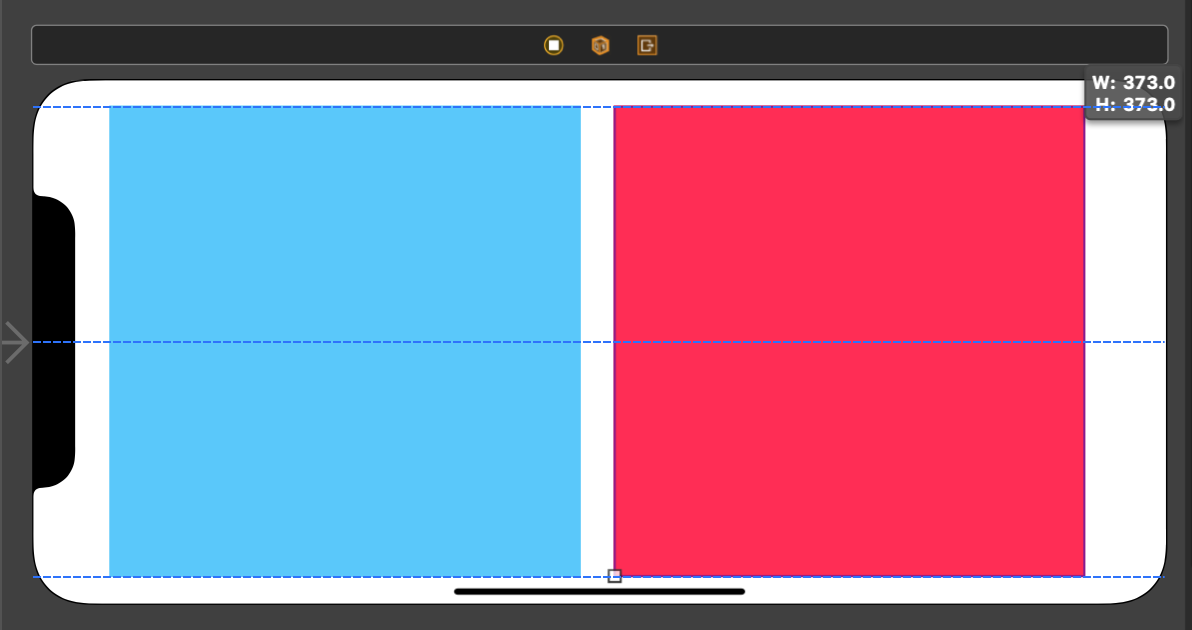
Then, take the first view and set its width equal to the Superview's width.
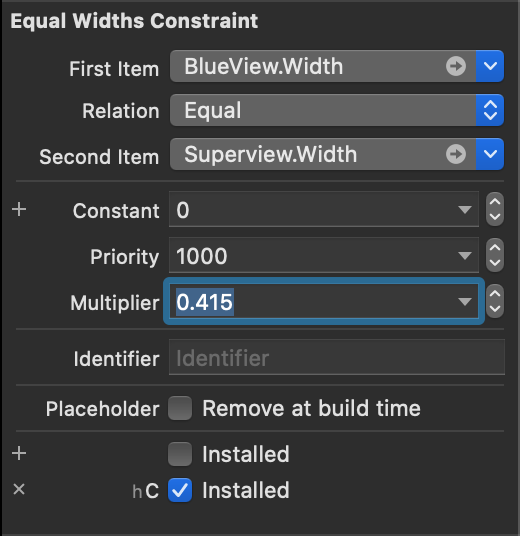
Double-click on this new "Equal Width" constraint to view its parameters.
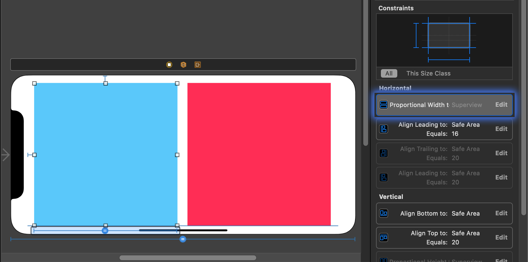
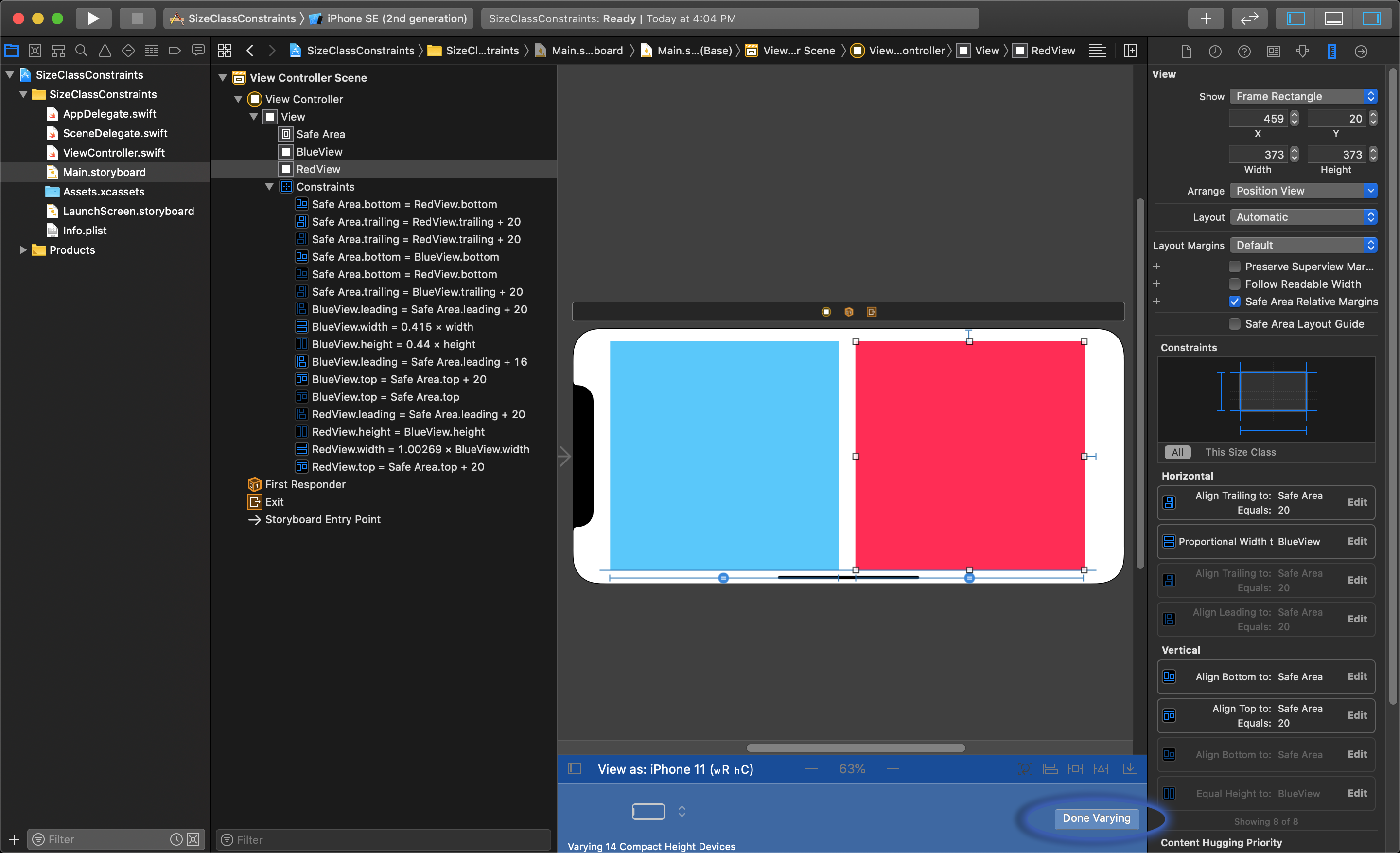
This shows the constraint's parameters in the Size Inspector on the right.

Set the multiplier to 0.45 to set the width of the left view to be less than half the width of the main view.
The red view on the right needs its width set to the left blue view's width.
This sets the both views width to the same width Multiplier of the main view, and will finish the setup of the additional layout.
To end editing the additional constraints, you must click the Done Varying button at the bottom of the editor.
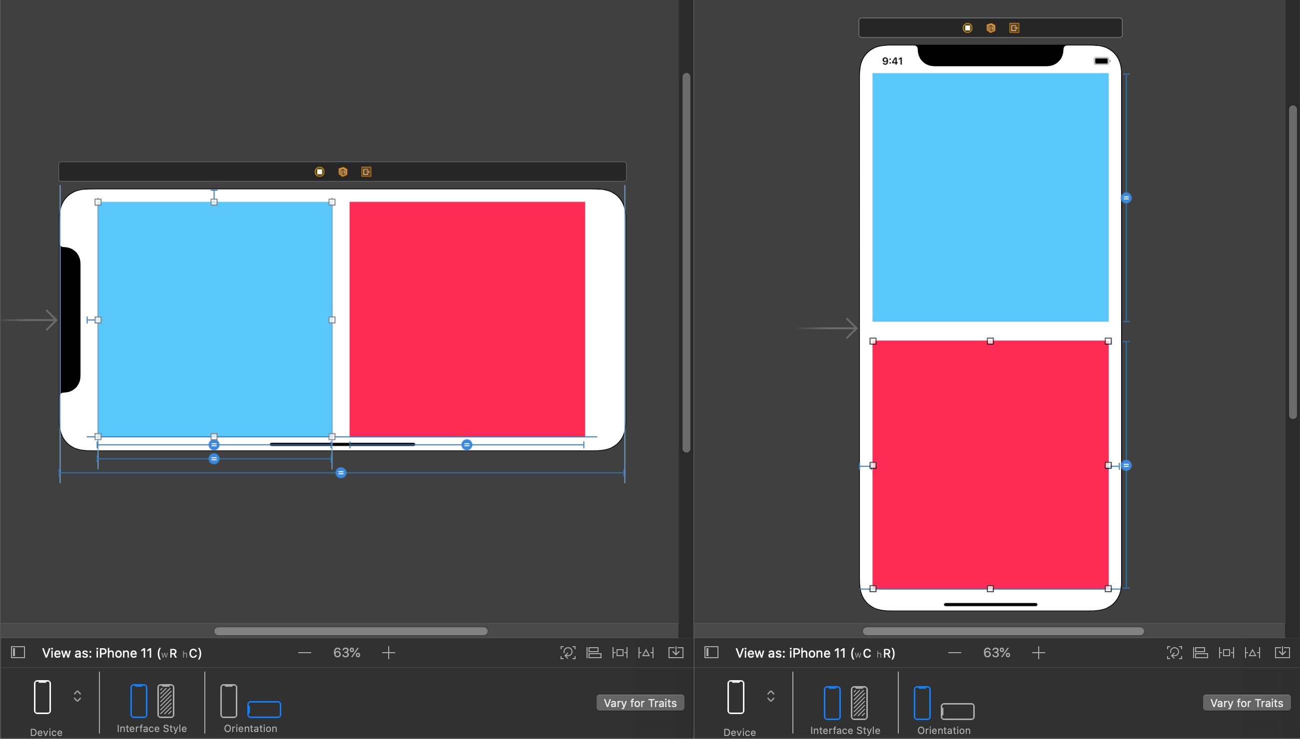
This turns the bottom bar grey again and shows the device and orientation options once again. Now the layout looks correct in both portrait and landscape mode.